

1. Class Diagram
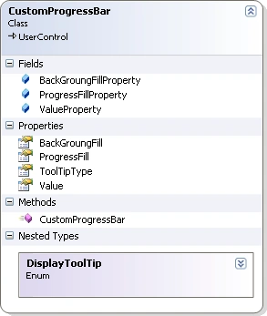
As you can see from the class diagram the class is inherited from UserControl and I have created three dependency properties and wrappers to access them along
with the one general property.
- BackGroundFill is a brush which is used to paint the background (not completed portion) of progress bar.
- ProgressFill is used to paint the completed part of the progress bar.
- Value is an integer used for current progress of the progress bar.
- ToolTipType is an enumerated type allows
selecting the displayed tool tip over the completed portion of progress bar.
ToolTipType can contain these values listed below.
- None
- Valueonly
- ValuewithPercentage
- ValuewithPercentageComplete
2. Design(XAML Code)
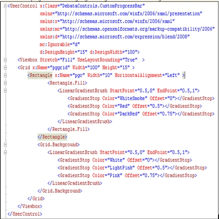
In the XAML code described below I have a user control called Custom Progress
Bar. Inside this I have a Viewbox with stretch set as Fill within which I have a
grid panel which acts as background for the progress bar. The grid contains a
rectangle used to indicate the progress or completed part of the bar. You will also notice background of grid or fill area of rectangle has been assigned to some
default linear gradient brush. Based on the value of the progress bar we are
going to change the width of the rectangle.
3. Class Definition(C# Code)
using
System;
using
System.Collections.Generic;
using
System.Linq;
using
System.Text;
using
System.Windows;
using
System.Windows.Controls;
using
System.Windows.Data;
using
System.Windows.Documents;
using
System.Windows.Input;
using
System.Windows.Media;
using
System.Windows.Media.Imaging;
using
System.Windows.Navigation;
using
System.Windows.Shapes;
namespace
DebataControls
{
///
<summary>
///
Interaction logic for CustomProgressBar.xaml
///
</summary>
public
partial class
CustomProgressBar : UserControl
{
public CustomProgressBar()
{
InitializeComponent();
}
public static
readonly
DependencyProperty ValueProperty =
DependencyProperty.Register("Value",typeof(int),
typeof(CustomProgressBar),
new
PropertyMetadata(0, new
PropertyChangedCallback(
(obj, chng) =>
{
CustomProgressBar current = (CustomProgressBar)obj;
current.pgc.Width = (int)chng.NewValue;
switch (current.ToolTipType)
{
case
DisplayToolTip.None:
current.pgc.ToolTip = null;
break;
case
DisplayToolTip.Valueonly:
current.pgc.ToolTip = chng.NewValue;
break;
case
DisplayToolTip.ValuewithPercentage:
current.pgc.ToolTip = string.Format("{0}
%", chng.NewValue);
break;
case
DisplayToolTip.ValuewithPercentageComplete:
current.pgc.ToolTip = string.Format("{0}
% Complete", chng.NewValue);
break;
default:
break;
}
}
)));
public int
Value
{
get {
return (int)GetValue(ValueProperty); }
set { SetValue(ValueProperty,
value); }
}
public static
readonly
DependencyProperty ProgressFillProperty =
DependencyProperty.Register("ProgressFill",
typeof(Brush)
, typeof(CustomProgressBar),
new PropertyMetadata(
new
LinearGradientBrush(new
GradientStopCollection
{
new
GradientStop{ Color = Brushes.Silver.Color
, Offset=0}
,new
GradientStop{ Color = Brushes.Red.Color
, Offset=0.5}
,new
GradientStop{ Color = Brushes.DarkRed.Color
, Offset=0.75}
}, new
Point(0.5, 0), new
Point(0.5, 1)),
new
PropertyChangedCallback(
(obj, chng) =>
{
CustomProgressBar current
= (CustomProgressBar)obj;
current.pgc.Fill = (Brush)chng.NewValue;
}
)));
public Brush
ProgressFill
{
get {
return (Brush)GetValue(ProgressFillProperty);
}
set { SetValue(ProgressFillProperty,
Value); }
}
public static
readonly
DependencyProperty BackGroungFillProperty =
DependencyProperty.Register("BackGroungFill",
typeof(Brush),
typeof(CustomProgressBar),
new PropertyMetadata(
new
LinearGradientBrush(new
GradientStopCollection
{
new
GradientStop{ Color = Brushes.White.Color
, Offset=0}
,new
GradientStop{ Color = Brushes.LightPink.Color
, Offset=0.5}
,new
GradientStop{ Color = Brushes.Pink.Color
, Offset=0.75}
}, new
Point(0.5, 0), new
Point(0.5, 1)),
new
PropertyChangedCallback(
(obj, chng) =>
{
CustomProgressBar current
= (CustomProgressBar)obj;
current.pggrid.Background = (Brush)chng.NewValue;
}
)));
public Brush
BackGroungFill
{
get {
return (Brush)GetValue(BackGroungFillProperty);
}
set {
SetValue(BackGroungFillProperty, Value); }
}
public
DisplayToolTip ToolTipType
{
get;
set;
}
public enum
DisplayToolTip:byte
{
None,
Valueonly,
ValuewithPercentage,
ValuewithPercentageComplete
}
}
}
Now your custom WPF progress bar is ready. Build the assembly and add a reference in your XAML page to use the control.
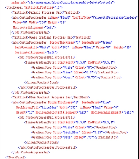
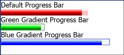
Above XAML shows the implementation of three colored progress bar shown at the
start of this article.
Mahesh ChandPosted Sep 3, 2011, 10:52 AM
I like how you have class diagram displayed. Good stuff. One thing would be nice if you could add a property to load an image as background of the control.
Dan SullivanPosted Sep 2, 2011, 3:57 PM
Narayan, nice introduction to creating WPF UserControls with a nice example. ~Dan