

Introduction
An enterprise-class UI design language and React UI library with high-quality React components, one of the best React UI libraries for enterprises.
Popover is the floating card popped by clicking or hovering. It is a simple popup menu to provide extra information or operations.
Preconditions
- Javascript
- Basic knowledge of React JS
- Node.js
- V.S. Code,Visual Studio
- typescript
We cover the below things in this article,
- Create React application
- Installation of Ant Design UI
- How to create a popover of Ant Design UI in React js.
Here we will follow the steps for creating a popover.
Step 1. Run the below command to create a React.js project.
npx create-react-app my-app --template typescriptStep 2. Run the below command to install Ant Design UI.
npm i @ant-design/icons
npm i antd
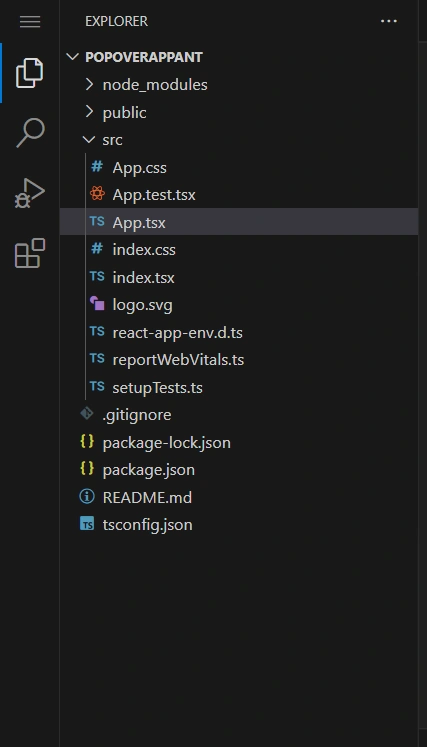
Create the files according to the below image.
Step 3. Add the below code in the App.tsx.
import React from 'react';
import logo from './logo.svg';
import './App.css';
import { Button, Popover } from 'antd';

const text = <span>Title</span>;
const content = (
  <div>
    <p>Content</p>
    <p>Content</p>
  </div>
);

const buttonWidth = 70;

function App() {
  return (
    <div style={{marginTop: '300px', marginLeft: '300px'}}>
    <div style={{ marginLeft: buttonWidth, whiteSpace: 'nowrap' }}>
      <Popover placement="topLeft" title={text} content={content} trigger="click">
        <Button>TL</Button>
      </Popover>
      <Popover placement="top" title={text} content={content} trigger="click">
        <Button>Top</Button>
      </Popover>
      <Popover placement="topRight" title={text} content={content} trigger="click">
        <Button>TR</Button>
      </Popover>
    </div>
    <div style={{ width: buttonWidth, float: 'left' }}>
      <Popover placement="leftTop" title={text} content={content} trigger="click">
        <Button>LT</Button>
      </Popover>
      <Popover placement="left" title={text} content={content} trigger="click">
        <Button>Left</Button>
      </Popover>
      <Popover placement="leftBottom" title={text} content={content} trigger="click">
        <Button>LB</Button>
      </Popover>
    </div>
    <div style={{ width: buttonWidth, marginLeft: buttonWidth * 4 + 24 }}>
      <Popover placement="rightTop" title={text} content={content} trigger="click">
        <Button>RT</Button>
      </Popover>
      <Popover placement="right" title={text} content={content} trigger="click">
        <Button>Right</Button>
      </Popover>
      <Popover placement="rightBottom" title={text} content={content} trigger="click">
        <Button>RB</Button>
      </Popover>
    </div>
    <div style={{ marginLeft: buttonWidth, clear: 'both', whiteSpace: 'nowrap' }}>
      <Popover placement="bottomLeft" title={text} content={content} trigger="click">
        <Button>BL</Button>
      </Popover>
      <Popover placement="bottom" title={text} content={content} trigger="click">
        <Button>Bottom</Button>
      </Popover>
      <Popover placement="bottomRight" title={text} content={content} trigger="click">
        <Button>BR</Button>
      </Popover>
    </div>
  </div>
  );
}

export default App;
Step 4. Add the below code in package.json
{
  "name": "popoverappant",
  "version": "0.1.0",
  "private": true,
  "dependencies": {
    "@ant-design/icons": "^5.1.4",
    "@testing-library/jest-dom": "^5.16.5",
    "@testing-library/react": "^13.4.0",
    "@testing-library/user-event": "^13.5.0",
    "@types/jest": "^27.5.2",
    "@types/node": "^16.18.34",
    "@types/react": "^18.2.8",
    "@types/react-dom": "^18.2.4",
    "antd": "^5.5.2",
    "react": "^18.2.0",
    "react-dom": "^18.2.0",
    "react-scripts": "5.0.1",
    "typescript": "^4.9.5",
    "web-vitals": "^2.1.4"
  },
  "scripts": {
    "start": "react-scripts start",
    "build": "react-scripts build",
    "test": "react-scripts test",
    "eject": "react-scripts eject"
  },
  "eslintConfig": {
    "extends": [
      "react-app",
      "react-app/jest"
    ]
  },
  "browserslist": {
    "production": [
      ">0.2%",
      "not dead",
      "not op_mini all"
    ],
    "development": [
      "last 1 chrome version",
      "last 1 firefox version",
      "last 1 safari version"
    ]
  }
}
Step 5. Run the below command to run the application.
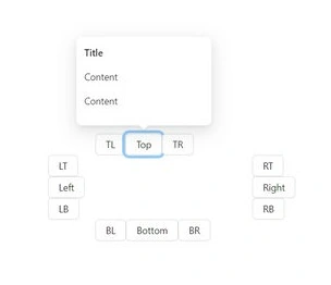
npm startAfter running this command, we will get this popover.
Summary
In this article, we learned how to create a popover using Ant Design UI with React JS and Typescript.
Join the conversation! Your thoughts help the community grow.