

Main Layout Controls:
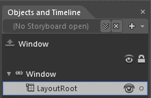
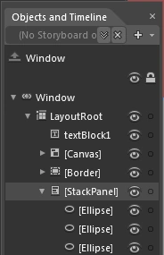
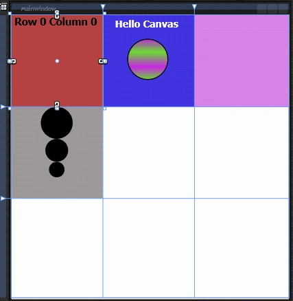
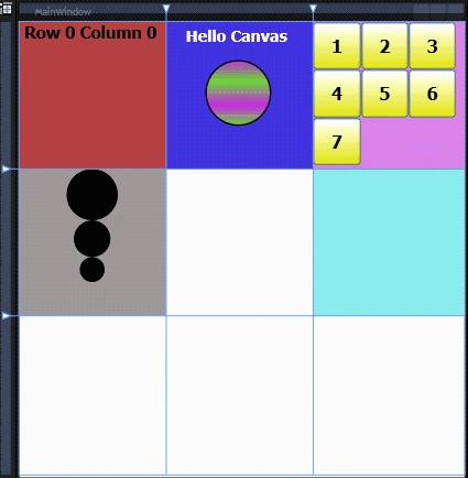
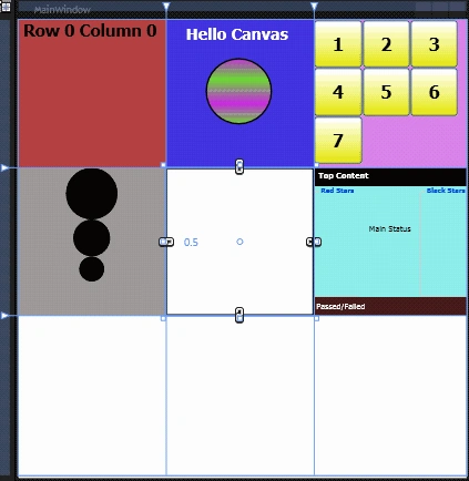
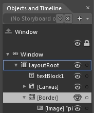
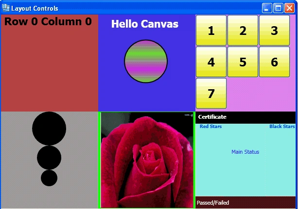
GRID: The most popular and most used WPF layout element is the Grid. When we open a new document in Expression Blend the default layout control shown is the "Grid" named Layout root which you can see in the object and timeline panel. That is because the Grid is by far the most common layout control. A Grid is very much like an HTML table in which we can define rows and columns and then place content inside of those rows and columns.
<Window
xmlns="http://schemas.microsoft.com/winfx/2006/xaml/presentation"
xmlns:x="http://schemas.microsoft.com/winfx/2006/xaml"
x:Class="LayoutControls.MainWindow"
x:Name="Window"
Title="Layout Controls"
Width="614" Height="654">
<Grid x:Name="LayoutRoot" Height="616">
</Grid>
</Window>
Rows and Columns in a Grid:
<Grid.RowDefinitions>
<RowDefinition Height="200"/>
<RowDefinition Height="200"/>
<RowDefinition Height="200"/>
</Grid.RowDefinitions>
<Grid.ColumnDefinitions>
<ColumnDefinition Width="200"/>
<ColumnDefinition Width="200"/>
<ColumnDefinition Width="200"/>
</Grid.ColumnDefinitions>
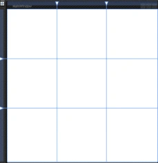
Note: Blue lines are showing the Rows and columns.
You can add controls into the Grid and then specify in the XAML what row and column they should be in.eg –
"Adding Textblock control"
<TextBlock Grid.Row="0" Grid.Column="0" TextWrapping="Wrap"
Margin="0,2,4,4" x:Name="textBlock1" Background="#FFB64545"
Text =" Row 0 Column 0" FontSize="22" FontWeight="Bold"
</TextBlock> 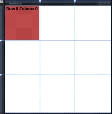
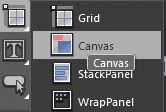
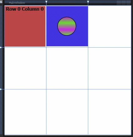
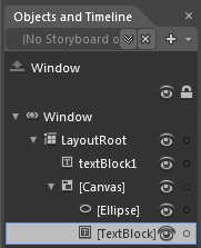
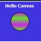
CANVAS : The next layout element is the "The Canvas will never change the position of child elements in it, and I find this very useful. The canvas is the only layout that allows you to have an absolute co-ordinate for each object. They don't get affected by resizing the window at all. To see how the Canvas works, you have to make some changes to the project:
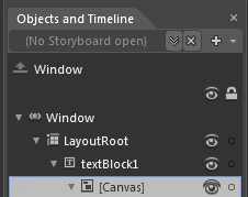
<Canvas Background="#FF4033DC" Grid.Column="1" Margin="0,2,0,5.447">
<Ellipse Height="90" Canvas.Left="53" Canvas.Top="52" Width="90">
<Ellipse.Fill>
<LinearGradientBrush EndPoint="0.5,1" StartPoint="0.5,0">
<GradientStop Color="#FFB52ACC"/>
<GradientStop Color="#FF67D630" Offset="1"/>
<GradientStop Color="#FFC526E0" Offset="0.687"/>
<GradientStop Color="#FF67D630" Offset="0.317"/>
</LinearGradientBrush>
</Ellipse.Fill>
</Ellipse>
</Canvas> 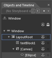
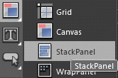
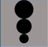
STACKPANEL: Another very useful layout element is the StackPanel it will position content inside of it for you in a stacking manner (horizontally or vertically). This is different from the Grid or Canvas, which rely on the developer to set the relative or absolute positioning of child objects. Lets see the use of Stack panel:
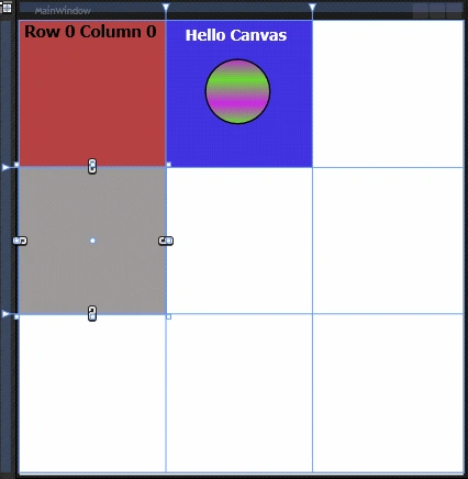
<StackPanel Grid.Row="1" Orientation="Vertical" Background="#FF9B9898" Margin="-1.5,0,0.5,0" Height="200" >
<Ellipse Fill="Black" Height="70" Margin="65.5,0"/>
<Ellipse Fill="Black" Height="50" Margin="75.5,0"/>
<Ellipse Fill="Black" Height="35" Margin="83.5,0"/>
</StackPanel>
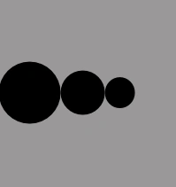
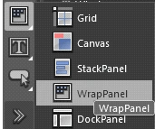
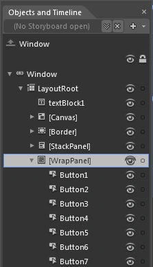
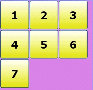
WRAPPANEL : Wrapping allows you to have many different things on a page, and as you resize, they're wrapped to the next line if they don't fit on the current one. This is perfect for things such as album art, etc. Also, since they display so nicely, they can be animated to display one by one, and fade in an out – perfect for a fluid interface for showing photographs, or icons. A WrapPanel layout control is similar to a StackPanel layout control, but it allows elements to be placed on multiple lines. When an object overflows off the edge of the panel, it will not be clipped, but instead will be wrapped to the next line.
<WrapPanel Background="#FFD87FE7" Grid.Column="2" Margin="0,0,-6,0">
<Button x:Name="Button1" Content="1" Height="65" Width="65" FontSize="24" FontWeight="Bold"/>
<Button x:Name="Button2" Content="2" Height="65" Width="65" FontSize="24" FontWeight="Bold"/>
<Button x:Name="Button3" Content="3" Height="65" Width="65" FontSize="24" FontWeight="Bold"/>
<Button x:Name="Button4" Content="4" Height="65" Width="65" FontSize="24" FontWeight="Bold"/>
<Button x:Name="Button5" Content="5" Height="65" Width="65" FontSize="24" FontWeight="Bold"/>
<Button x:Name="Button6" Content="6" Height="65" Width="65" FontSize="24" FontWeight="Bold"/>
<Button x:Name="Button7" Content="7" Height="65" Width="65" FontSize="24" FontWeight="Bold"/>
</WrapPanel>
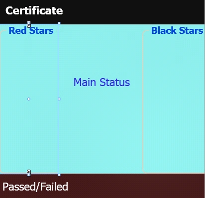
DOCKPANEL: DockPanel is useful for describing the overall layout of a simple user interface. A DockPanel arranges each child element so that it fills a particular edge of the panel. If multiple children are docked to the same edge, they simply stack up against that edge in order.It provides an easy docking of elements to the left, right, top, bottom or center of the panel. The dock side of an element is defined by the attached property DockPanel.Dock. To dock an element to the center of the panel, it must be the last child of the panel and the LastChildFill property must be set to true. DockPanel is useful for describing the overall layout of a simple user interface. A DockPanel arranges each child element so that it fills a particular edge of the panel. If multiple children are docked to the same edge, they simply stack up against that edge in order.
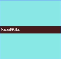
<DockPanel Background="#FF8AE9E7" Grid.Column="2" Grid.Row="1" Width="Auto" Height="Auto" Margin="0,0,-6,0">
<StatusBar Width="Auto" Height="25" Background="#FF451B1B" DockPanel.Dock="Bottom">
<TextBlock Width="Auto" Height="Auto" Foreground="#FFFEFEFE" Text="Passed/Failed"/>
</StatusBar>
</DockPanel>
<GroupBox DockPanel.Dock="Left" Width="58.666" Height="Auto" Header="Red Stars" FontSize="9.333" FontWeight="Bold"/>
<GroupBox DockPanel.Dock="Right" Width="62.666" Height="Auto" Header="Black Stars" FontSize="9.333" FontWeight="Bold" />
<Menu Width="Auto" Height="25" DockPanel.Dock="Top" Background="#FF161511" Foreground="#FFCE2525">
<MenuItem Header="Top Content" Foreground="White" FontWeight="Bold"/>
</Menu>
<Canvas Width="Auto" Height="Auto">
<TextBlock Width="Auto" Height="Auto" Text="Main Status" TextWrapping="Wrap"
Canvas.Left="15.632" Canvas.Top="51"/>
</Canvas>
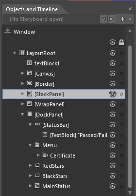
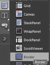
<Border BorderThickness="5,2" Height="200" Width="200" Canvas.Left="0.5" Canvas.Top="199.5" HorizontalAlignment="Left">
<Image Margin="2,-0.5,2,-1.5" Source="pic5.jpg" Stretch="Fill" Width="190" Height="194" />
</Border>


Join the conversation! Your thoughts help the community grow.