

PrimeNG is a free and open source library of UI components. It is developed by PrimeTek Informatics. PrimeNG provides 80+ UI components in a single library, so there would be no need to add any other library for different UIs. It includes all UI components like Datatable, Breadcrumbs, Input, Accordion, Notification message box, Multimedia, and Menu etc.

Note
Make sure that you have Node.js installed. If not, then install the latest version of Node.js by Downloading Node.js from Node.js website.
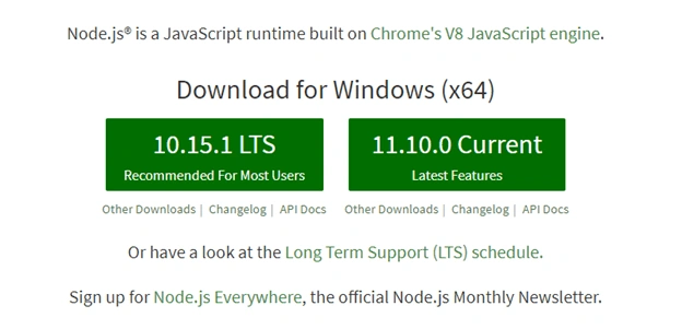
After downloading Node.js, install it and check the node and npm versions. To check the version, open command prompt, and type -
node -v
npm -v
Step 1
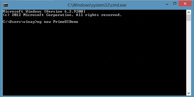
Create a new Angular project. Use the following command to create a new Angular project.
ng new PrimeUIDemo
Step 2
Open this project in Visual Studio Code and install required packages for PrimeNG.
Open the Terminal by going to View >terminal or by pressing Ctrl + ~.
Use the following commands to install PrimeNG packages in the project.
- npm install primeng --save
- npm install primeicons --save


Step 3
Some PrimeNG components use Angular animations to improve the user interface, so we need to install Angular animation.
Install the Angular animation module in this project by using the following command.
- npm install --save @angular/animations

Now, open the package.json file and check if PrimeNG is installed.
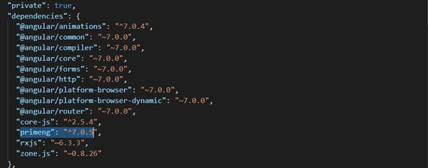
Step 4 - Style Configuration
Configure required styles at the styles section in angular.json file or style.css.
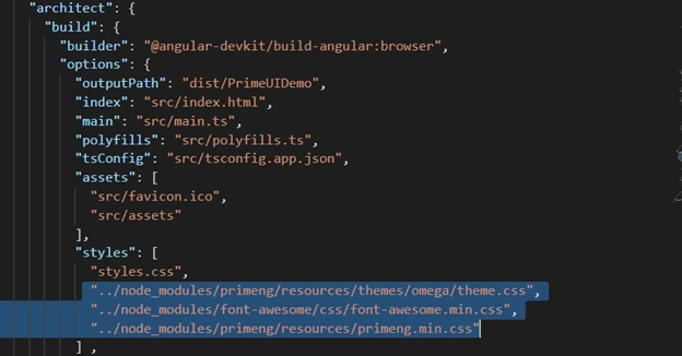
Step 5
Configure PrimeNG module in the app.module.ts file. Let's import the required module in this file.
App.module.ts fille
- import { BrowserModule } from '@angular/platform-browser';
- import { NgModule } from '@angular/core';
- import { BrowserAnimationsModule } from "@angular/platform-browser/animations";
- import { AppRoutingModule } from './app-routing.module';
- import { AppComponent } from './app.component';
- import { AccordionModule } from 'primeng/components/accordion/accordion';
- import {OrderListModule} from 'primeng/orderlist';
- @NgModule({
- declarations: [
- AppComponent
- ],
- imports: [
- BrowserModule,
- AppRoutingModule,BrowserAnimationsModule,AccordionModule,OrderListModule
- ],
- providers: [],
- bootstrap: [AppComponent]
- })
- export class AppModule { }
Step 7
Now, open app.component.html and add PrimeNG accordion, a list. Add the following lines in this file.
- <p-accordion>
- <p-accordionTab header="India">
- <p-orderList [value]="Indiastate">
- <ng-template let-state pTemplate="item">
- <div class="ui-helper-clearfix">
- <div style="font-size:16px;float:left;margin:5px">{{state}}</div>
- </div>
- </ng-template>
- </p-orderList>
- </p-accordionTab>
- <p-accordionTab header="Australia">
- <p-orderList [value]="Ausstate">
- <ng-template let-Ausstate pTemplate="item">
- <div class="ui-helper-clearfix">
- <div style="font-size:16px;float:left;margin:5px">{{Ausstate}}</div>
- </div>
- </ng-template>
- </p-orderList>
- </p-accordionTab>
- <p-accordionTab header="SriLanka">
- <p-orderList [value]="Slstate">
- <ng-template let-Slstate pTemplate="item">
- <div class="ui-helper-clearfix">
- <div style="font-size:16px;float:center;margin:5px">{{Slstate}}</div>
- </div>
- </ng-template>
- </p-orderList>
- </p-accordionTab>
- </p-accordion>
Open app.component.ts file and add the following code.
- import { Component } from '@angular/core';
- @Component({
- selector: 'app-root',
- templateUrl: './app.component.html',
- styleUrls: ['./app.component.css']
- })
- export class AppComponent {
- Indiastate = [
- "Rajasthan",
- "UP",
- "Mp",
- "Delhi",
- "Goa",
- "Gurjat",
- "Punjab"
- ];
- Ausstate = [
- "New South Wales",
- "Queensland",
- "South Australia",
- "Tasmania"
- ];
- Slstate = [
- "Kandy",
- "Galle",
- "Kegalle",
- "Mannar"
- ];
- }
Step 9
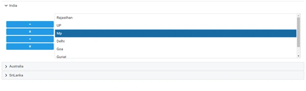
Run the project and check the result.

Click on the country name and check the list of states.
Summary
In this article, we learned the basics of PrimeNG, a free and open source library of UI components for Angular applications.
Join the conversation! Your thoughts help the community grow.