

Overview
SharePoint Framework (SPFx) Extensions extend the SharePoint user experience by customizing predefined placeholders in the SharePoint site. As of today, we can extend the top and bottom placeholders to customize the header and footer sections. React components help to develop functionality independently by maintaining the separation of concerns. These React components can be used as part of an application customizer.
Create SPFx Solution
Open the command prompt. Create a directory for the SPFx solution.
md spfx-react-applicationcustomizerNavigate to the above-created directory.
cd spfx-react-applicationcustomizerRun the Yeoman SharePoint Generator to create the solution.
yo @microsoft/sharepointThe Yeoman generator will present you with the wizard by asking questions about the solution to be created.
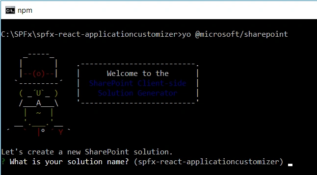
- Solution Name: Hit Enter to have a default name (spfx-react-applicationcustomizer in this case) or type in any other name for your solution.
- Selected Choice: Hit enter
- The target for the component: Here, we can select the target environment where we are planning to deploy the client web part i.e. SharePoint Online or SharePoint OnPremise (SharePoint 2016 onwards).
- Selected Choice: SharePoint Online only (latest)
- Place of files: We may choose to use the same folder or create a subfolder for our solution.
- Selected Choice: Use the current folder.
- Deployment option: Selecting Y will allow the app to be deployed instantly to all sites and will be accessible everywhere.
- Selected Choice: Y
- Permissions to access web APIs: Choose if the components in the solution require permissions to access web APIs that are unique and not shared with other components in the tenant.
- Selected Choice: N (solution contains unique permissions)
Type of client-side component to create
We can choose to create a client-side web part or an extension.
Selected Choice: Extension
Type of client-side extension to create
We can choose to create an Application customizer, a Field customizer, or a ListView Command Set.
- Selected Choice: Application Customizer
- Application customizer name: Hit Enter to select the default name or type in any other name.
- Selected Choice: ReactHeaderFooter
- Application customizer description: Hit Enter to select the default description or type in any other value.
- Selected Choice: Adds custom header and footer to a SharePoint site
The Yeoman generator will perform a scaffolding process to generate the solution. The scaffolding process will take a significant amount of time.
Once the scaffolding process is completed, lock down the version of project dependencies by running the below command.
npm shrinkwrapIn the command prompt type the below command to open the solution in the code editor of your choice.
code .To use Office 365 UI Fabric controls, type the below command. We will explicitly install the 5.x version of the Office UI Fabric to our solution.
npm install [email protected] --saveOne thing to note here is that during the solution creation, the Yeoman generator did not ask us for the choice of language to use.
Implement application customizer
Open ReactHeaderFooterApplicationCustomizer.ts under “\src\extensions\ reactHeaderFooter \” folder. To get access to placeholders on the page, use the below imports.
import {
    BaseApplicationCustomizer,
    PlaceholderContent,
    PlaceholderName
} from '@microsoft/sp-application-base';
Update the interface IReactHeaderFooterApplicationCustomizerProperties to include Top and Bottom properties.
export interface IReactHeaderFooterApplicationCustomizerProperties {
    // This is an example; replace with your own property
    Bottom: string;
}
Implement the OnInit method.
private _bottomPlaceholder: PlaceholderContent | undefined;
public onInit(): Promise<void> {
    Log.info(LOG_SOURCE, `Initialized ${strings.Title}`);
    // Added to handle possible changes on the existence of placeholders.
    this.context.placeholderProvider.changedEvent.add(this, this._renderPlaceHolders);
    // Call render method for generating the HTML elements.
    this._renderPlaceHolders();
    return Promise.resolve();
}
Implement _renderPlaceHolders method
private _renderPlaceHolders(): void {
    console.log('Available placeholders: ',
        this.context.placeholderProvider.placeholderNames.map(name => PlaceholderName[name]).join(', '));
    // Handling the bottom placeholder
    if (!this._bottomPlaceholder) {
        this._bottomPlaceholder =
            this.context.placeholderProvider.tryCreateContent(
                PlaceholderName.Bottom,
                { onDispose: this._onDispose });
        // The extension should not assume that the expected placeholder is available.
        if (!this._bottomPlaceholder) {
            console.error('The expected placeholder (Bottom) was not found.');
            return;
        }
    }
}
Use this.context.placeholderProvider.tryCreateContent to get access to the placeholder, without assuming that the placeholder will exist.
Implement the OnDispose method
private _onDispose(): void {
    console.log('[ReactHeaderFooterApplicationCustomizer._onDispose] Disposed custom top and bottom placeholders.');
}
Implement React component as footer
Add a new file to the solution – ReactFooter.tsx.
import * as React from "react";
import { Link } from 'office-ui-fabric-react/lib/Link';
import { CommandBar, ICommandBarItemProps } from 'office-ui-fabric-react/lib/CommandBar';
export interface IReactFooterProps {}
export default class ReactFooter extends React.Component<IReactFooterProps> {
    constructor(props: IReactFooterProps) {
        super(props);
    }
    public render(): JSX.Element {
        return (
            <div className={"ms-bgColor-themeDark ms-fontColor-white"}>
                <CommandBar
                    items={this.getItems()}
                />
            </div>
        );
    }
    // Data for CommandBar
    private getItems = (): ICommandBarItemProps[] => {
        return [
            {
                key: 'microsoft',
                name: 'Microsoft',
                cacheKey: 'myCacheKey', // changing this key will invalidate this items cache
                iconProps: {
                    iconName: 'AzureLogo'
                },
                href: 'https://www.Microsoft.com'
            },
            {
                key: 'officeUIFabric',
                name: 'Office UI Fabric',
                iconProps: {
                    iconName: 'OneDrive'
                },
                href: 'https://dev.office.com/fabric',
                ['data-automation-id']: 'uploadButton'
            }
        ];
    }
}
Open src\extensions\reactHeaderFooter\ReactHeaderFooterApplicationCustomizer.ts. Add below imports.
import * as React from "react";
import * as ReactDOM from "react-dom";
import ReactFooter, { IReactFooterProps } from "./ReactFooter";
Update _renderPlaceHolders method to include our React component.
private _renderPlaceHolders(): void {
    console.log('Available placeholders: ',
        this.context.placeholderProvider.placeholderNames.map(name => PlaceholderName[name]).join(', '));
    // Handling the bottom placeholder
    if (!this._bottomPlaceholder) {
        this._bottomPlaceholder = this.context.placeholderProvider.tryCreateContent(
            PlaceholderName.Bottom,
            { onDispose: this._onDispose }
        );
        // The extension should not assume that the expected placeholder is available.
        if (!this._bottomPlaceholder) {
            console.error('The expected placeholder (Bottom) was not found.');
            return;
        }
        const elem: React.ReactElement<IReactFooterProps> = React.createElement(ReactFooter);
        ReactDOM.render(elem, this._bottomPlaceholder.domElement);
    }
}
Test the extension
Open serve.json under the config folder.
Update the properties section to include the page URL to test.
private _renderPlaceHolders(): void {
    console.log('Available placeholders: ',
        this.context.placeholderProvider.placeholderNames.map(name => PlaceholderName[name]).join(', '));
    // Handling the bottom placeholder
    if (!this._bottomPlaceholder) {
        this._bottomPlaceholder = this.context.placeholderProvider.tryCreateContent(
            PlaceholderName.Bottom,
            { onDispose: this._onDispose }
        );
        // The extension should not assume that the expected placeholder is available.
        if (!this._bottomPlaceholder) {
            console.error('The expected placeholder (Bottom) was not found.');
            return;
        }
        const elem: React.ReactElement<IReactFooterProps> = React.createElement(ReactFooter);
        ReactDOM.render(elem, this._bottomPlaceholder.domElement);
    }
}
On the command prompt, type the below command.
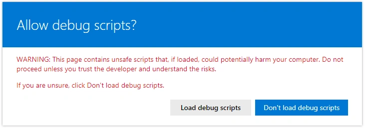
gulp serveThe SharePoint site will open. Click “Load debugs scripts”.
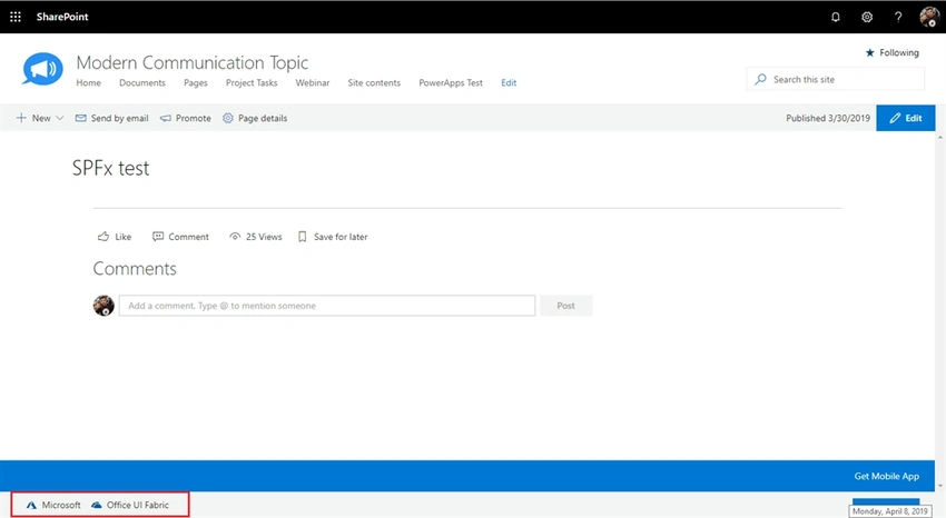
Observe the footer on the page.
Summary
Application customizer SharePoint Framework extension helps to extend the predefined placeholders on Modern SharePoint pages. React components help to develop functionality independently by maintaining the separation of concerns. These React components can be used as part of the application customizer.
Muthu RajPosted Jul 21, 2025, 2:22 PM
node V22.15.1 Should i install react and reactdom separately otherwise my customizer not loading weired id error Uncaught (in promise) Error: Failed to create application customizer 'ClientSideExtension.ApplicationCustomizer.26a66ea3-4346-4087-a07f-8d30f5ae460b'. Error information is 'Extension failed to load for componentId "26a66ea3-4346-4087-a07f-8d30f5ae460b".'.
Bhargava ChPosted Feb 19, 2021, 5:44 AM
Hi Nandeep, When I am trying to create same in 2019 onprim, I am facing the issue with below error Uncaught Error: No callbackHandler found. at Function.e._sendMessage (sp-pages-assembly.js?uniqueId=2g4QD:119) at Function.e.sendPageLoaded (sp-pages-assembly.js?uniqueId=2g4QD:119) at t._onPostMessageLoading (sp-pages-assembly.js?uniqueId=2g4QD:119) at t._onPostMessage (sp-pages-assembly.js?uniqueId=2g4QD:119) and Custom action component ids are specified by query parameters but matching manifests cannot be found
sajid kaziPosted Oct 7, 2020, 12:48 AM
The footer with application customizer is always on the screen. cant we make it behave like default footer (i.e. appear only at the end of the page on scroll) ?
Helder AlexandrePosted May 19, 2020, 12:28 PM
Thanks fo sharing! Can you tell me if this work with SP2019?
Manoj MittalPosted Apr 11, 2019, 1:32 AM
Thanks for sharing, Can we use cache for entire "getItems" instead of individual footer items.