Microsoft's Expression Blend 2 is a new design tool for use with WPF and Silverlight applications. Blend, as it is popularly called, supports both Silverlight 1.0 and 2.0 applications. The following step-by-step procedure explains how to create a button, set its background, foreground, and transform it.
Prerequisite: It is assumed that you have installed Silverlight 2 and Expression Blend 2 (along with SP1) on your machine before you begin with the steps below.
The first step you need to do after launching Expression Blend is, select the File-> New option. This launches the New Project dialog box as shown in Figure 1.
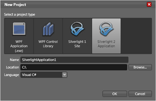
Figure 1: New Project Dialog Box in Expression Blend 2
Next, you will select Silverlight 2 Application in the New Project dialog box and specify a name. When you click OK, this project/solution will have number of files created by default in it. Assume that you have typed GradientButton as the name for the project.
The file, Page.xaml, will be opened in the Design view by default as shown in Figure 2.
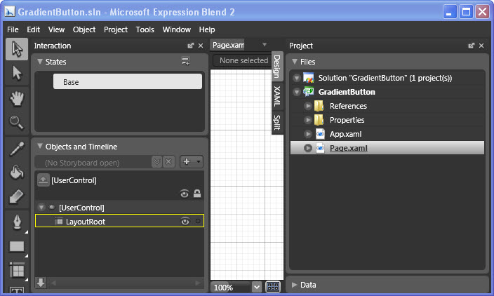
Figure 2: The default Design view of Page.xaml
As seen in Figure 2, many windows are open, which makes your task of designing the user interface a little difficult. The Project window shows you the existing files in the project/solution while the Interaction window shows user interactions.
What you can do now to make your design experience easier is, close the windows Project and Interaction, which are not required at this point of time. This will result in the design view similar to Figure 3.
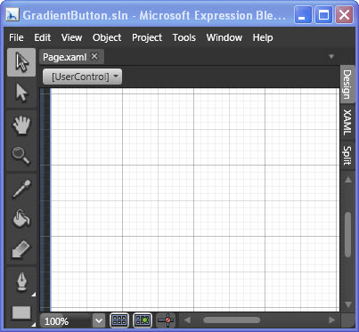
Figure 3: The Design view of Page.xaml with the windows closed
Next, you create a button by first scrolling down on the ToolBox seen on the left side and selecting the button control. Draw a button of a desired size. To view the properties of the button, you will need to display the Properties window which had been closed earlier. You can do this by clicking on Window menu to display its options as shown in Figure 4.
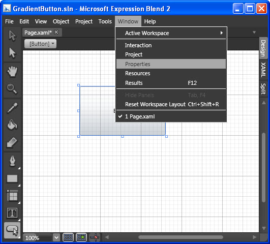
Figure 4: Selecting the Properties option on the Windows menu
There are many properties of the Button control that can be configured. As seen in Figure 5, you will expand the Brushes properties so that you can change the color settings for the button.
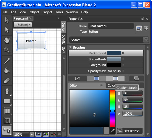
Figure 5: The Brushes properties
You can experiment with different color gradients and styles for the background, foreground and border color of the button using the respective brushes. Figure 6 shows an example of how these can be configured.
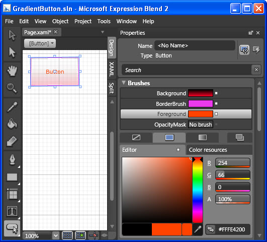
Figure 6: Setting the various brush values
Once the colors have been set, you scroll down to the Transform property and set the values as shown in Figure 7. This option lets you transform a control, and apply operations such as a scale or a skew on it.

Figure 7: Setting the Transform values
Voila! You now have a button with a color gradient and a transform. You are now ready to build and test the solution with Internet Explorer. Building a project/solution in Expression Blend 2 is similar to how you do it in Visual Studio applications except that here you use one of the Project menu options instead of Build. Testing is even easier, you just click Test Solution option on the Project menu or press the F5 key.
The output would be as shown in Figure 8.
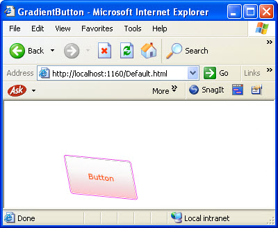
Figure 8: The output
Summary: The article showed how to create a Silverlight 2 application with Expression Blend 2, add a button control and configure its properties.