In this second part of the article series, we will see how to design the UI for the game. But first let's populate some numbers in the numbers. We want that the buttons should contain a random series of numbers between 1 to 8 each time the page is viewed. To achieve this, we need to generate random numbers using the Random class. If the random number generated was not between 1 to 8, we need to keep trying till we come across a number between 1 to 8 and also it must be unique because two buttons cannot have the same content. Therefore, we need to write a user-defined function to generate the random series and then call it in the constructor of MainPage.
private int GenerateRandom()
{
int val = 0;
Random r = new Random();
val = r.Next(0, 10);
return val;
}
public MainPage()
{
InitializeComponent();
Button b;
int[] arr= new int[9];
int i=0;
// Generate random numbers and assign each to the buttons
// in the grid
foreach (Control c in GridRoot.Children)
{
int content = GenerateRandom();
while (arr.Contains(content)||(arr[i]==9))
{
content = GenerateRandom();
}
arr[i] = content;
b = (Button)c;
if (b.Content.ToString() == " ")
{
if (arr[i] != 9)
{
b.Content = arr[i];
}
}
i++;
}
}
When you test the application, you will find that each button contains a number between 1 to 8 and each time the page is viewed, the contents are different. Mission accomplished!
Next, we need to proceed to the designing. Launch Microsoft Expression Blend and open the project Puzzler in it.
Click on MainPage.xaml and select the first button. Click Object->Edit Control Parts (Template)->Edit a Copy. Retain the default name ButtonStyle1 for the style and click OK. In the properties window, select Background and specify the values as shown below:
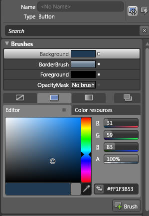
Figure 1
Next, set the Text properties as shown below:
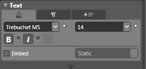
Figure 2
To exit the editing scope of the style, click the Scope Up button under Objects and Timeline.
Apply the style to each of the buttons by right clicking each button and then selecting
Edit Control Parts (Template)->Apply Resource and then selecting the ButtonStyle1.
Save, build and test the application. Further, in the next part of this series, we will set drop shadow effects, add more code-behind functionality and add event handling logic.
Part I | Part III | Part IV