Introduction
If you have ever worked with Microsoft Word then you will be able to understand what the GridSplitter looks like - it's exactly similar to the Splitter seen in Word that is used to split a document view into two panes.
The GridSplitter control in Silverlight allows the user to split a Grid column or row at runtime. Its basic purpose is to redistribute the available space by adjusting the rows or columns in width or height.
The GridSplitter class is defined in the System.Windows.Controls namespace.
Before you use this control, you must have a Grid existing with some rows and columns.
Let us now see how to use this control. Create a new Silverlight project named GridSplitterDemo.
Next, in the Design view of Page.xaml, define two rows and two columns within the default Grid and configure the properties of the Grid as shown below.
Page.xaml
<UserControl x:Class="GridSplitterDemo.Page"
xmlns="http://schemas.microsoft.com/winfx/2006/xaml/presentation"
xmlns:x="http://schemas.microsoft.com/winfx/2006/xaml"
Width="400" Height="300">
<Grid x:Name="LayoutRoot" ShowGridLines="True" Background="LemonChiffon" Width="400" Height="300">
<Grid.RowDefinitions>
<RowDefinition Height="200" />
<RowDefinition Height="200" />
</Grid.RowDefinitions>
<Grid.ColumnDefinitions>
<ColumnDefinition Width="150" />
<ColumnDefinition Width="150" />
</Grid.ColumnDefinitions>
</Grid>
</UserControl>
Modify the Page.xaml now so that it looks like below:
Page.xaml
<UserControl x:Class="GridSplitterDemo.Page"
xmlns:controls="clr-namespace:System.Windows.Controls;assembly=System.Windows.Controls"
xmlns="http://schemas.microsoft.com/winfx/2006/xaml/presentation"
xmlns:x="http://schemas.microsoft.com/winfx/2006/xaml"
Width="400" Height="300">
<Grid x:Name="LayoutRoot" ShowGridLines="True" Background="LemonChiffon" Width="400" Height="300">
<Grid.RowDefinitions>
<RowDefinition Height="200" />
<RowDefinition Height="200" />
</Grid.RowDefinitions>
<Grid.ColumnDefinitions>
<ColumnDefinition Width="150" />
<ColumnDefinition Width="150" />
</Grid.ColumnDefinitions>
<controls:GridSplitter x:Name="grsplSplitter" Grid.Row="0" Grid.Column="1" VerticalAlignment="Stretch" HorizontalAlignment="Center" Background="IndianRed" Width="5"></controls:GridSplitter>
</Grid>
</UserControl>
Here, you have defined a namespace named controls to reference the assembly System.Windows.Controls. Later, this namespace will be used when using the GridSplitter control.
The section
<controls:GridSplitter x:Name="grsplSplitter" Grid.Row="0" Grid.Column="1" VerticalAlignment="Stretch" HorizontalAlignment="Center" Background="IndianRed" Width="5"></controls:GridSplitter>
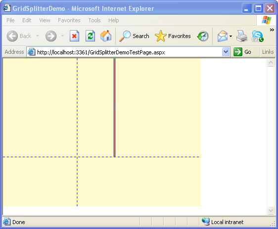
in Page.xaml defines the GridSplitter. It is placed in the first row and second column, and assigned a color, IndianRed, with horizontal alignment Center.
If you wish, you can also use the RowSpan or ColumnSpan properties to span the splitter across several rows or columns.
The ShowsPreview property (not shown here) allows you to specify whether you want to
show preview of the grid panes at runtime.
When you run the application, by selecting Debug-Start without Debugging in Visual Studio IDE, you will see the following output as shown

Figure 1
Conclusion: Thus, in this article, you learnt how to work with the GridSplitter control of Silverlight 2.