Introduction
The Grid control is the most flexible layout panel, and supports arranging controls in multi-row and multi-column layouts. It is conceptually similar to an HTML Table element.
Grids (not to be confused with DataGrids) offer easy and exact placement by providing a table-like structure. You declare rows and columns, and then place controls into a specific row/column location (spanning across rows or columns as needed).
Fortunately, if you're coming from a Web development background, you'll find Silverlight's Grid control easy to use and quick to comprehend because it's similar to what you've already been using. It acts much like HTML's table tag and allows data and controls to be arranged in a tabular-style view.
Overview
The Grid control allows rows and columns to be defined much more concisely compared to HTML. With the HTML table tag, you're forced to repeat multiple tr and td tags to create rows and columns. The Grid control allows rows and column information to be defined in one location using RowDefinition and ColumnDefinition tags.
For example, we could declare a Grid layout has three rows and three columns using XAML like below:
<Grid x:Name="LayoutRoot" Background="White" ShowGridLines="True">
<Grid.RowDefinitions>
<RowDefinition></RowDefinition>
<RowDefinition></RowDefinition>
<RowDefinition></RowDefinition>
</Grid.RowDefinitions>
<Grid.ColumnDefinitions>
<ColumnDefinition></ColumnDefinition>
<ColumnDefinition></ColumnDefinition>
<ColumnDefinition></ColumnDefinition>
</Grid.ColumnDefinitions>
</Grid>
This example sets the Grid's ShowGridLines attribute to True, which is nice for seeing the initial layout of a Grid control. We define the Rows for a table inside the Grid.RowDefinitions element. For each Row, we add a RowDefinition element and we define the Columns for a table inside the Grid.ColumnDefinitions element. For each Column, we add a ColumnDefinition element
The result of the Xaml code is shown in
Defining Column Width, and Row Height
To provide the most flexibility, Grid columns and rows are sized by GridLength objects which use the GridUnitType, which in turn allows you to choose among:
- Auto (size based on the size properties of the object being placed in the grid)
- Pixel (size in pixels)
- Star (size based on a weighted proportion of the available space)
Omitting the width and/or height properties makes all columns and rows the same size
To see the effect of all this we'll modify the previous example We'll then fill our grid with controls and take a look at some of the effects.
<Grid x:Name="LayoutRoot" Background="White" ShowGridLines="True">
<Grid.RowDefinitions>
<RowDefinition Height="Auto"></RowDefinition>
<RowDefinition Height="100"></RowDefinition>
<RowDefinition Height="*"></RowDefinition>
</Grid.RowDefinitions>
<Grid.ColumnDefinitions>
<ColumnDefinition></ColumnDefinition>
<ColumnDefinition></ColumnDefinition>
<ColumnDefinition></ColumnDefinition>
</Grid.ColumnDefinitions>
<Button Content="Auto Size" Height="150" Grid.Row="0" Grid.Column="0" ></Button>
<Button Content="Pixel Size" Height="150" Grid.Row="1" Grid.Column="1"></Button>
<Button Content="Star Size" Height="150" Grid.Row="2" Grid.Column="2"></Button>
</Grid>
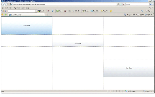
The result of the Xaml code is shown in

As described above, the RowDefinitions define three rows. The first row will size itself to the TextBlock placed in the row. The second has a fixed height of 100. The third will take all the remaining space. When you use the * character to define a row height, you're essentially telling the Grid to assign the row 100 percent of the remaining space. You could also omit the Height attribute entirely in this case and achieve the same effect.
Now we need The second and third to be float, but in a 3:4 proportion with the remaining space, So we will change the RowDefinition of the tow rows to be like:
<RowDefinition Height="30*"></RowDefinition>
<RowDefinition Height="40*"></RowDefinition>
The result of Xaml Code is shown in
Instead of setting the exact width for every column and height for every row you can use the alternative MinWidth / MaxWidth and MinHeight / MaxHeight properties.
Placing Controls within the Grid
The controls can be placed inside a Grid using Grid.Row and Grid.Column attributes. In situations where you need a control to span multiple rows or columns, you can use the Grid.RowSpan or Grid.ColumnSpan attributes. For example, the following button would be placed in the first row and span two columns:
<Button Content="Auto Size" Height="150" Width="300" Grid.Row="0" Grid.Column="0" Grid.ColumnSpan="2" ></Button>
The result will be
Similar Articles
References
Silverlight Books
Additional Resources