Introduction
In this article we will see how we can achieve the Closable Tab Item in Tab Control in WPF.
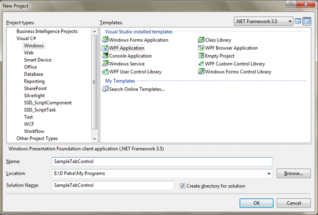
Crating WPF Application Project
Fire up Visual Studio 2008 and Create a WPF Application and name the project as SampleTabControl.
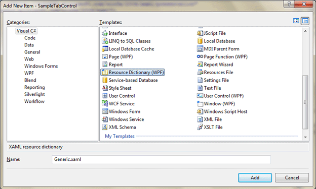
First we need to create a Resource Dictionary where we would make our custom control.
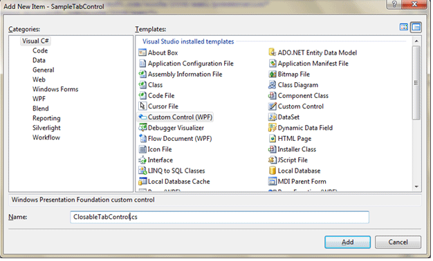
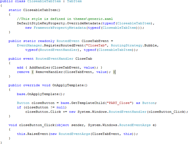
Now before designing the custom control write the below CS file which is the class that would inherit TabItem.
Write the following code into the cs file as follows:
Our resource dictionary need to changed based on our style. The following XAML represents it.
<ResourceDictionary
xmlns="http://schemas.microsoft.com/winfx/2006/xaml/presentation"
xmlns:x="http://schemas.microsoft.com/winfx/2006/xaml"
xmlns:local="clr-namespace:CloseableTabItemDemo"
>
<Style x:Key="TabItemFocusVisual">
<Setter Property="Control.Template">
<Setter.Value>
<ControlTemplate>
<Rectangle SnapsToDevicePixels="true" Stroke="Black" StrokeDashArray="1 2" StrokeThickness="1" Margin="3,3,3,1"/>
</ControlTemplate>
</Setter.Value>
</Setter>
</Style>
<SolidColorBrush x:Key="TabControlNormalBorderBrush" Color="#8C8E94"/>
<LinearGradientBrush x:Key="TabItemHotBackground" EndPoint="0,1" StartPoint="0,0">
<GradientStop Color="#EAF6FD" Offset="0.15"/>
<GradientStop Color="#D9F0FC" Offset=".5"/>
<GradientStop Color="#BEE6FD" Offset=".5"/>
<GradientStop Color="#A7D9F5" Offset="1"/>
</LinearGradientBrush>
<SolidColorBrush x:Key="TabItemSelectedBackground" Color="#F9F9F9"/>
<SolidColorBrush x:Key="TabItemHotBorderBrush" Color="#3C7FB1"/>
<SolidColorBrush x:Key="TabItemDisabledBackground" Color="#F4F4F4"/>
<SolidColorBrush x:Key="TabItemDisabledBorderBrush" Color="#FFC9C7BA"/>
<Style TargetType="{x:Type local:CloseableTabItem}" >
<Style.Resources>
<LinearGradientBrush x:Key="ButtonNormalBackground" EndPoint="0,1" StartPoint="0,0">
<GradientStop Color="#F3F3F3" Offset="0"/>
<GradientStop Color="#EBEBEB" Offset="0.5"/>
<GradientStop Color="#DDDDDD" Offset="0.5"/>
<GradientStop Color="#CDCDCD" Offset="1"/>
</LinearGradientBrush>
<LinearGradientBrush x:Key="ButtonOverBackground" EndPoint="0,1" StartPoint="0,0">
<GradientStop Color="#FFFAFAFA" Offset="0"/>
<GradientStop Color="#FFE0E0E3" Offset="1"/>
</LinearGradientBrush>
<LinearGradientBrush x:Key="ButtonPressedBackground" EndPoint="0,1" StartPoint="0,0">
<GradientStop Color="#FFE0E0E2" Offset="0"/>
<GradientStop Color="#FFF8F8F8" Offset="1"/>
</LinearGradientBrush>
<SolidColorBrush x:Key="ButtonNormalBorder" Color="#FF969696"/>
<Style x:Key="CloseableTabItemButtonStyle" TargetType="{x:Type Button}">
<Setter Property="FocusVisualStyle" Value="{x:Null}"/>
<Setter Property="Background" Value="{StaticResource ButtonNormalBackground}"/>
<Setter Property="BorderBrush" Value="{StaticResource ButtonNormalBorder}"/>
<Setter Property="BorderThickness" Value="1"/>
<Setter Property="Foreground" Value="{DynamicResource {x:Static SystemColors.ControlTextBrushKey}}"/>
<Setter Property="HorizontalContentAlignment" Value="Center"/>
<Setter Property="VerticalContentAlignment" Value="Center"/>
<Setter Property="Padding" Value="4"/>
<Setter Property="Template">
<Setter.Value>
<ControlTemplate TargetType="{x:Type Button}">
<Grid>
<Border SnapsToDevicePixels="true" x:Name="Chrome" Background="{TemplateBinding Background}" BorderBrush="{TemplateBinding BorderBrush}" BorderThickness="{TemplateBinding BorderThickness}" CornerRadius="2" Opacity="0" />
<ContentPresenter SnapsToDevicePixels="{TemplateBinding SnapsToDevicePixels}" HorizontalAlignment="{TemplateBinding HorizontalContentAlignment}" Margin="{TemplateBinding Padding}" VerticalAlignment="{TemplateBinding VerticalContentAlignment}" RecognizesAccessKey="True"/>
</Grid>
<ControlTemplate.Triggers>
<Trigger Property="IsMouseOver" Value="True">
<Setter Property="Opacity" TargetName="Chrome" Value="1"/>
<Setter Property="Background" TargetName="Chrome" Value="{DynamicResource ButtonOverBackground}" />
</Trigger>
<Trigger Property="IsPressed" Value="True">
<Setter Property="Opacity" TargetName="Chrome" Value="1"/>
<Setter Property="Background" TargetName="Chrome" Value="{DynamicResource ButtonPressedBackground}" />
</Trigger>
<Trigger Property="IsEnabled" Value="false">
<Setter Property="Foreground" Value="#ADADAD"/>
</Trigger>
</ControlTemplate.Triggers>
</ControlTemplate>
</Setter.Value>
</Setter>
</Style>
</Style.Resources>
<Setter Property="FocusVisualStyle" Value="{StaticResource TabItemFocusVisual}"/>
<Setter Property="Foreground" Value="Black"/>
<Setter Property="Padding" Value="6,1,6,1"/>
<Setter Property="BorderBrush" Value="{StaticResource TabControlNormalBorderBrush}"/>
<Setter Property="Background" Value="{StaticResource ButtonNormalBackground}"/>
<Setter Property="HorizontalContentAlignment" Value="Stretch"/>
<Setter Property="VerticalContentAlignment" Value="Stretch"/>
<Setter Property="Template">
<Setter.Value>
<ControlTemplate TargetType="{x:Type local:CloseableTabItem}">
<Grid SnapsToDevicePixels="true">
<Border x:Name="Bd" Background="{TemplateBinding Background}" BorderBrush="{TemplateBinding BorderBrush}" BorderThickness="1,1,1,0" >
<DockPanel x:Name="ContentPanel">
<Button x:Name="PART_Close" HorizontalAlignment="Center" Margin="3,0,3,0" VerticalAlignment="Center" Width="16" Height="16" DockPanel.Dock="Right" Style="{DynamicResource CloseableTabItemButtonStyle}" ToolTip="Close Tab">
<Path x:Name="Path" Stretch="Fill" StrokeThickness="0.5" Stroke="#FF333333" Fill="#FF969696" Data="F1 M 2.28484e-007,1.33331L 1.33333,0L 4.00001,2.66669L 6.66667,6.10352e-005L 8,1.33331L 5.33334,4L 8,6.66669L 6.66667,8L 4,5.33331L 1.33333,8L 1.086e-007,6.66669L 2.66667,4L 2.28484e-007,1.33331 Z " HorizontalAlignment="Stretch" VerticalAlignment="Stretch"/>
</Button>
<ContentPresenter x:Name="Content" SnapsToDevicePixels="{TemplateBinding SnapsToDevicePixels}" ContentSource="Header" RecognizesAccessKey="True" HorizontalAlignment="Center" VerticalAlignment="Center" Margin="{TemplateBinding Padding}"/>
</DockPanel>
</Border>
</Grid>
<ControlTemplate.Triggers>
<Trigger Property="IsMouseOver" SourceName="PART_Close" Value="True">
<Setter Property="Fill" TargetName="Path" Value="#FFB83C3D"/>
</Trigger>
<Trigger Property="IsPressed" SourceName="PART_Close" Value="True">
<Setter Property="Fill" TargetName="Path" Value="#FF9Dclosable-tab-control-in-wpf8"/>
</Trigger>
<Trigger Property="IsMouseOver" Value="true">
<Setter Property="Background" TargetName="Bd" Value="{StaticResource TabItemHotBackground}"/>
</Trigger>
<Trigger Property="IsSelected" Value="true">
<Setter Property="Panel.ZIndex" Value="1"/>
<Setter Property="Background" TargetName="Bd" Value="{StaticResource TabItemSelectedBackground}"/>
</Trigger>
<MultiTrigger>
<MultiTrigger.Conditions>
<Condition Property="IsSelected" Value="false"/>
<Condition Property="IsMouseOver" Value="true"/>
</MultiTrigger.Conditions>
<Setter Property="BorderBrush" TargetName="Bd" Value="{StaticResource TabItemHotBorderBrush}"/>
</MultiTrigger>
<Trigger Property="TabStripPlacement" Value="Bottom">
<Setter Property="BorderThickness" TargetName="Bd" Value="1,0,1,1"/>
</Trigger>
<Trigger Property="TabStripPlacement" Value="Left">
<Setter Property="BorderThickness" TargetName="Bd" Value="1,1,0,1"/>
</Trigger>
<Trigger Property="TabStripPlacement" Value="Right">
<Setter Property="BorderThickness" TargetName="Bd" Value="0,1,1,1"/>
</Trigger>
<MultiTrigger>
<MultiTrigger.Conditions>
<Condition Property="IsSelected" Value="true"/>
<Condition Property="TabStripPlacement" Value="Top"/>
</MultiTrigger.Conditions>
<Setter Property="Margin" Value="-2,-2,-2,-1"/>
<Setter Property="Margin" TargetName="ContentPanel" Value="0,0,0,1"/>
</MultiTrigger>
<MultiTrigger>
<MultiTrigger.Conditions>
<Condition Property="IsSelected" Value="true"/>
<Condition Property="TabStripPlacement" Value="Bottom"/>
</MultiTrigger.Conditions>
<Setter Property="Margin" Value="-2,-1,-2,-2"/>
<Setter Property="Margin" TargetName="ContentPanel" Value="0,1,0,0"/>
</MultiTrigger>
<MultiTrigger>
<MultiTrigger.Conditions>
<Condition Property="IsSelected" Value="true"/>
<Condition Property="TabStripPlacement" Value="Left"/>
</MultiTrigger.Conditions>
<Setter Property="Margin" Value="-2,-2,-1,-2"/>
<Setter Property="Margin" TargetName="ContentPanel" Value="0,0,1,0"/>
</MultiTrigger>
<MultiTrigger>
<MultiTrigger.Conditions>
<Condition Property="IsSelected" Value="true"/>
<Condition Property="TabStripPlacement" Value="Right"/>
</MultiTrigger.Conditions>
<Setter Property="Margin" Value="-1,-2,-2,-2"/>
<Setter Property="Margin" TargetName="ContentPanel" Value="1,0,0,0"/>
</MultiTrigger>
<Trigger Property="IsEnabled" Value="false">
<Setter Property="Background" TargetName="Bd" Value="{StaticResource TabItemDisabledBackground}"/>
<Setter Property="BorderBrush" TargetName="Bd" Value="{StaticResource TabItemDisabledBorderBrush}"/>
<Setter Property="Foreground" Value="{DynamicResource {x:Static SystemColors.GrayTextBrushKey}}"/>
</Trigger>
</ControlTemplate.Triggers>
</ControlTemplate>
</Setter.Value>
</Setter>
</Style>
</ResourceDictionary>
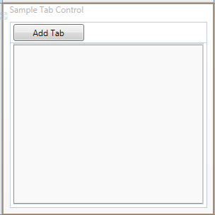
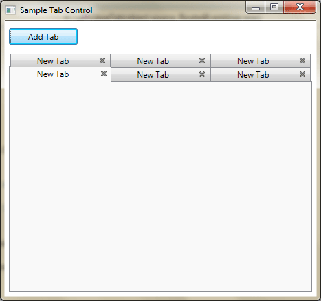
Now we would design our application, the basic need is to have one Add Button and A Tab Control. See below figure.
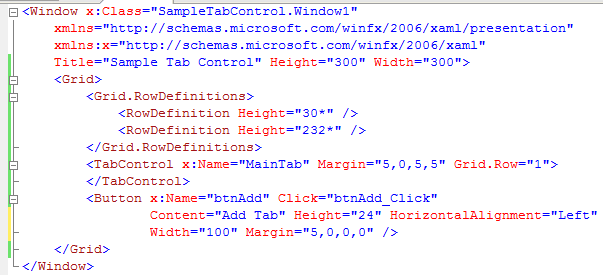
The following figure is for your XAML reference.
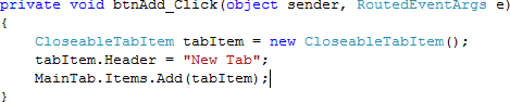
Now in the Button Click event write the below code to add a TabItem at runtime.
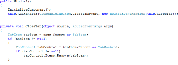
For closing the TabItem add the Handler for it. Follow below code:
Now our application is ready to test. Run it.
That's it. We have successfully achieved adding and removing tabs at run time.
Hope this article helps.