A Canvas panel is used to position child elements by using coordinates that are relative to the canvas area. Here are some of the properties of Canvas panels.
-
The default values of Height and Width properties of a Canvas are 0. If you do not set these values, you will not see a canvas unless child elements are automatically resizable.
-
Child elements on a Canvas are never resized.
-
The vertical and horizontal alignments on child elements do not work. Child elements are placed on positions set by the Canvas Left, Top, Right, and Bottom properties.
-
Margin does work partially. If Left property of Canvas is set, Right property does not work. If Top property of Canvas is set, Bottom property does not work.
The Canvas element in XAML represents a Canvas control.
<Canvas/>
The Canvas control has three properties. The Left property represents the distance between the left side of a control and its parent container Canvas. The Top property represents the distance between the top of a control and its parent container Canvas.
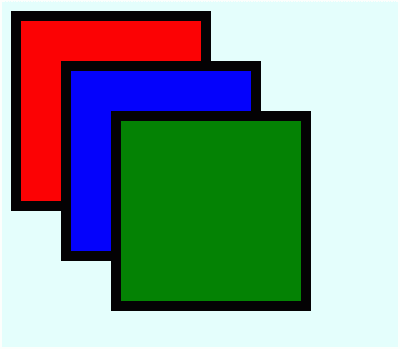
The code in Listing 1 creates a Canvas and adds three Rectangle controls and position them using Canvas control properties.
<Canvas Background="LightCyan" >
<Rectangle
Canvas.Left="10" Canvas.Top="10"
Height="200" Width="200"
Stroke="Black" StrokeThickness="10" Fill="Red" />
<Rectangle
Canvas.Left="60" Canvas.Top="60"
Height="200" Width="200"
Stroke="Black" StrokeThickness="10" Fill="Blue" />
<Rectangle
Canvas.Left="110" Canvas.Top="110"
Height="200" Width="200"
Stroke="Black" StrokeThickness="10" Fill="Green" />
</Canvas>
Listing 1
The output looks like Figure 1.

Figure 1
The Canvas class in WPF represents a Canvas control. The code listed in Listing creates a Canvas Panel dynamically, add three Rectangle controls to it, and sets their left and top positions using Canvas.SetLeft and Canvas.SetTop methods. The output of Listing generates Figure 1.
private void CreateDynamicCanvasPanel()
{
// Create a Canvas Panel control
Canvas canvasPanel = new Canvas();
// Set Canvas Panel properties
canvasPanel.Background = new SolidColorBrush(Colors.LightCyan );
// Add Child Elements to Canvas
Rectangle redRectangle = new Rectangle();
redRectangle.Width = 200;
redRectangle.Height = 200;
redRectangle.Stroke = new SolidColorBrush(Colors.Black);
redRectangle.StrokeThickness = 10;
redRectangle.Fill = new SolidColorBrush(Colors.Red);
// Set Canvas position
Canvas.SetLeft(redRectangle, 10);
Canvas.SetTop(redRectangle, 10);
// Add Rectangle to Canvas
canvasPanel.Children.Add(redRectangle);
// Add Child Elements to Canvas
Rectangle blueRectangle = new Rectangle();
blueRectangle.Width = 200;
blueRectangle.Height = 200;
blueRectangle.Stroke = new SolidColorBrush(Colors.Black);
blueRectangle.StrokeThickness = 10;
blueRectangle.Fill = new SolidColorBrush(Colors.Blue);
// Set Canvas position
Canvas.SetLeft(blueRectangle, 60);
Canvas.SetTop(blueRectangle, 60);
// Add Rectangle to Canvas
canvasPanel.Children.Add(blueRectangle);
// Add Child Elements to Canvas
Rectangle greenRectangle = new Rectangle();
greenRectangle.Width = 200;
greenRectangle.Height = 200;
greenRectangle.Stroke = new SolidColorBrush(Colors.Black);
greenRectangle.StrokeThickness = 10;
greenRectangle.Fill = new SolidColorBrush(Colors.Green);
// Set Canvas position
Canvas.SetLeft(greenRectangle, 110);
Canvas.SetTop(greenRectangle, 110);
// Add Rectangle to Canvas
canvasPanel.Children.Add(greenRectangle);
// Set Grid Panel as content of the Window
RootWindow.Content = canvasPanel;
}
Listing 1
The z-order of a control determines whether the control is in front of or behind another overlapping control. The default z-order of controls is the order controls are created in. The ZIndex property of Canvas represents the z-order of a control. The maximum value of ZIndex is 32766.
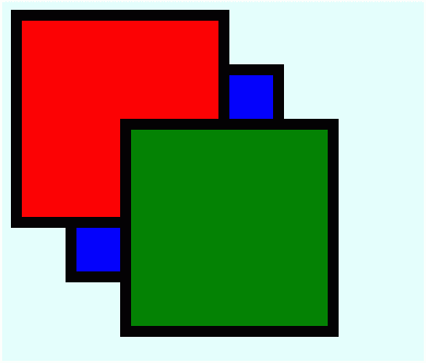
In Figure 1, the z-order of red, blue, and green rectangles is 1, 2, and 3 respectively. Now, the code in Listing 2 changes the z-order of these rectangles using the ZIndex property of the Canvas.
The code snippet in Listing 2 sets the position of the Canvas control in the left top corner of the page.
<Canvas Background="LightCyan" >
<Rectangle
Canvas.Left="10" Canvas.Top="10"
Height="200" Width="200"
Stroke="Black" StrokeThickness="10"
Fill="Red" Canvas.ZIndex="2" />
<Rectangle
Canvas.Left="60" Canvas.Top="60"
Height="200" Width="200"
Stroke="Black" StrokeThickness="10"
Fill="Blue" Canvas.ZIndex="1" />
<Rectangle
Canvas.Left="110" Canvas.Top="110"
Height="200" Width="200"
Stroke="Black" StrokeThickness="10"
Fill="Green" Canvas.ZIndex="3" />
</Canvas>
Listing 2
The new output looks like Figure 2 where blue rectangle is below red and green is at the top of both of them.

Figure 2