A Label control is used as a display medium for text on Forms. Label control does not participate in user input or capture mouse or keyboard events.
In this article, I will discuss how to create a Label control in Windows Forms at design-time as well as run-time. After that, I will continue discussing various properties and methods available for the Label control.
Creating a Label
There are two ways to create a control.
Design-time
First, we can use the Form designer of Visual Studio to create a control at design-time. In design-time mode, we can use visual user interfaces to create a control properties and write methods.
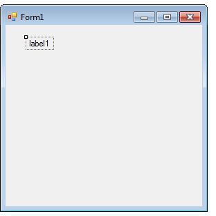
To create a Label control at design-time, you simply drag and drop a Label control from Toolbox to a Form. After you drag and drop a Label on a Form. The Label looks like Figure 1. Once a Label is on the Form, you can move it around and resize it using mouse and set its properties and events.

Figure 1
Run-time
Label class represents a Label control. We simply create an instance of Label class, set its properties and add this it to the Form controls.
In the first step, we create an instance of the Label class. The following code snippet creates a Label control object.
// Create a Label object
Label dynamicLabel = new Label();
In the next step, we set properties of a Label control. The following code snippet sets background color, foreground color, Text, Name, and Font properties of a Label.
// Set background and foreground
dynamicLabel.BackColor = Color.Red;
dynamicLabel.ForeColor = Color.Blue;
dynamicLabel.Text = "I am a Dynamic Label";
dynamicLabel.Name = "DynamicLabel";
dynamicLabel.Font = new Font("Georgia", 16);
In the last step, we need to add a Label control to the Form by calling Form.Controls.Add method. The following code snippet adds a Label control to a Form.
Controls.Add(dynamicLabel);
Setting Label Properties
After you place a Label control on a Form, the next step is to set properties.
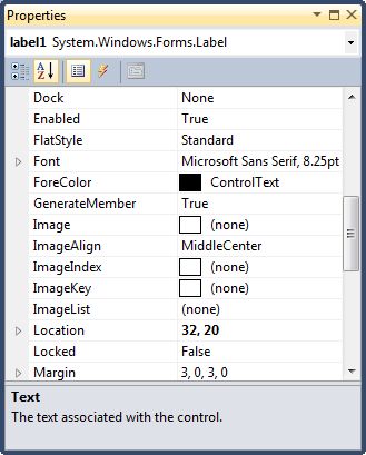
The easiest way to set properties is from the Properties Window. You can open Properties window by pressing F4 or right click on a control and select Properties menu item. The Properties window looks like Figure 2.

Figure 2
Name
Name property represents a unique name of a Label control. It is used to access the control in the code. The following code snippet sets and gets the name and text of a Label control.
dynamicLabel.Name = "DynamicLabel";
string name = dynamicLabel.Name;
Location, Height, Width, and Size
The Location property takes a Point that specifies the starting position of the Label on a Form. The Size property specifies the size of the control. We can also use Width and Height property instead of Size property. The following code snippet sets Location, Width, and Height properties of a Label control.
dynamicLabel.Location = new Point(20, 150);
dynamicLabel.Height = 40;
dynamicLabel.Width = 300;
Background, Foreground, BorderStyle
BackColor and ForeColor properties are used to set background and foreground color of a Label respectively. If you click on these properties in Properties window, the Color Dialog pops up.
Alternatively, you can set background and foreground colors at run-time. The following code snippet sets BackColor and ForeColor properties.
dynamicLabel.BackColor = Color.Red;
dynamicLabel.ForeColor = Color.Blue;
You can also set borders style of a Label by using the BorderStyle property. The BorderStyle property is represented by a BorderStyle enumeration that has three values – FixedSingle, Fixed3D, and None. The default value of border style is Fixed3D. The following code snippet sets the border style of a Label to FixedSingle.
dynamicLabel.BorderStyle = BorderStyle.FixedSingle;
Font
Font property represents the font of text of a Label control. If you click on the Font property in Properties window, you will see Font name, size and other font options. The following code snippet sets Font property at run-time.
dynamicLabel.Font = new Font("Georgia", 16);
Text and TextAlign, and TextLength
Text property of a Label represents the current text of a Label control. The TextAlign property represents text alignment that can be Left, Center, or Right. The TextLength property returns the length of a Label contents.
The following code snippet sets the Text and TextAlign properties and gets the size of a Label control.
dynamicLabel.Text = "I am Dynamic Label";
dynamicLabel.TextAlign = HorizontalAlignment.Center;
int size = dynamicLabel.TextLength;
Append Text
We can append text to a Label by simply setting Text property to current text plus new text you would want to append something like this.
dynamicLabel.Text += " Appended text";
AutoEllipsis
An ellipsis character (...) is used to give an impression that a control has more characters but it could not fit in the current width of the control. Figure 3 shows an example of an ellipsis character.

Figure 3
If AutoEllipsis property is true, it adds ellipsis character to a control if text in control does not fit. You may have to set AutoSize to false to see the ellipses character.
Image in Label
The Image property of a Label control is used to set a label background as an image. The Image property needs an Image object. The Image class has a static method called FromFile that takes an image file name with full path and creates an Image object.
You can also align image and text. The ImageAlign and TextAlign properties of Button are used for this purpose.
The following C# code snippet sets an image as a Label background.
dynamicLabel.Image = Image.FromFile(@"C:\Images\Dock.jpg");
dynamicLabel.ImageAlign = ContentAlignment.MiddleRight;
dynamicLabel.TextAlign = ContentAlignment.MiddleLeft;
dynamicLabel.FlatStyle = FlatStyle.Flat;
Summary
A Label control is used to display text on a Form. In this article, we discussed discuss how to create a Label control in Windows Forms at design-time as well as run-time. After that, we saw how to use various properties and methods.