In Windows Forms, there is a control called DateTimePicker which allows you to select a date from a dropdown list or a Calendar grid having dates and times. Silverlight 2 also has a similar control though slightly different in its functionality.
The DatePicker control in Silverlight 2 enables you to select a date by either typing it into a text field or by using a drop-down Calendar control. When you type a date directly into a text field, the Text property of the DatePicker control gets set.
The DatePicker control is available in the Toolbox of any Silverlight application and you can use the drag and drop approach to add it to your XAML code.
The DateValidationError event is raised if the DatePicker cannot convert whatever you typed to a valid date. Normally, this causes an exception, but you can set the ThrowException property to false in an event handler and prevent an exception from being raised.
Create a Silverlight 2 application using Visual Studio 2008.
Position the cursor in the XAML code between the <Grid></Grid> tags. Then, drag and drop the DatePicker control from the Toolbox. This results in the following XAML code.
Here, "basics" is the namespace for the reference to System.Windows.Controls assembly. Hence, when the DatePicker is added, it has a tag "basics" added to it as shown in the bolded code below.
If you have changed the name of the namespace to something else, you will see that name appearing.
<UserControl xmlns:basics="clr-namespace:System.Windows.Controls;assembly=System.Windows.Controls"
x:Class="SilverlightApplication1.Page"
xmlns="http://schemas.microsoft.com/winfx/2006/xaml/presentation"
xmlns:x="http://schemas.microsoft.com/winfx/2006/xaml"
Width="400" Height="300">
<Grid x:Name="LayoutRoot" Background="White">
<basics:DatePicker></basics:DatePicker>
</Grid>
</UserControl>
Now let us modify some of the DatePicker properties. Consider the below code. The section in bold are some of the properties.
<UserControl xmlns:basics="clr-namespace:System.Windows.Controls;assembly=System.Windows.Controls" x:Class="SilverlightApplication1.Page"
xmlns="http://schemas.microsoft.com/winfx/2006/xaml/presentation" xmlns:x="http://schemas.microsoft.com/winfx/2006/xaml"
Width="400" Height="300">
<Grid x:Name="LayoutRoot" Background="White">
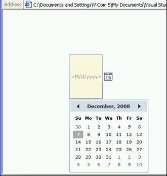
<basics:DatePicker Background="Cornsilk" Height="100" Width="100" IsEnabled="True" IsTodayHighlighted="true" ></basics:DatePicker>
</Grid>
</UserControl>
The Background property sets the background for the control. The Height and Width specify the size of the control and IsEnabled specifies whether the control is enabled or not. The IsTodayHighlighted property determines whether the current date is highlighted in the Calendar that is displayed.
There are plenty of more properties for this control that can be configured.
When you build and run the application, the resulting output would be as shown in Figure 1. The dropdown Calendar is not initially visible but only appears after you click the button.

Figure 1: DatePicker control in Silverlight 2