Objective:
This article aims to explore some of the Layout/Container controls provided in Silverlight 2.
Silverlight 2 provides you a number of container or layout controls. If you are coming from a Windows Forms or ASP.NET environment, you might find these controls totally new in appearance and behavior. Hence, this walkthrough will make it easier for you to understand what are these controls and how to work with them. Canvas, Grid, Border, and StackPanel are the commonly used layout controls.
Let us look at these one by one.
Creating a Canvas:
A Canvas layout control
We will first create a new Silverlight 2 application. Assume that it has been named SilverlightApp. In the default XAML code that is generated inside Page.xaml, make changes so that the Grid is replaced with Canvas. The background, height, and width are also to be changed. The code should look like below.
<UserControl x:Class="SilverlightApp.Page"
xmlns="http://schemas.microsoft.com/winfx/2006/xaml/presentation"
xmlns:x="http://schemas.microsoft.com/winfx/2006/xaml"
Width="400" Height="500">
<Canvas x:Name="LayoutRoot" Background="Bisque" Width="330" Height="300"> </Canvas>
</UserControl>
This Canvas will be the root and topmost control. All remaining controls that are created henceforth will be child controls.
Next, we create the Grid layout control as a child within the Canvas. A Grid container control allows you greater flexibility as compared to a Canvas because you can arrange child elements in rows and columns in a Grid. This is useful when you want to position items properly on the UI.
Creating the Grid with 2 columns and 5 rows
Add code as shown below after the Canvas block so that a grid of two columns and five rows is created:
<Canvas x:Name="LayoutRoot" Background="Bisque" Width="330" Height="300">
<Grid Background="Lavender" ShowGridLines="True" Width="300" Height="280" Margin="10,10,10,10">
<Grid.ColumnDefinitions>
<ColumnDefinition Width="150" />
<ColumnDefinition Width="150" />
</Grid.ColumnDefinitions>
<Grid.RowDefinitions>
<RowDefinition Height="Auto" />
<RowDefinition Height="Auto" />
<RowDefinition Height="Auto" />
<RowDefinition Height="Auto" />
<RowDefinition Height="Auto" />
</Grid.RowDefinitions>
</Grid>
</Canvas>
</UserControl>
ShowGridLines property of the Grid can be set to False if you don't want to display the lines. Auto is given for the Height of the RowDefinition to indicate automatic resizing of the row height as per the content.
After the last RowDefinition line, before the </Grid>, add the following code:
<TextBlock Grid.Row="0" Grid.ColumnSpan="2" Name="txtblkCars" Text="Layout Demo" Height="Auto" FontWeight="Bold" HorizontalAlignment="Center">
</TextBlock>
This creates a TextBlock control in the first row, spanning two columns and whose alignment is center. Notice that row numbering inside the grid begins from 0 for the first row. The Grid.Row and Grid.Column indicate which row and which column you want to place the child control in.
In the line following the </TextBlock> tag, add the following code:
<Border Grid.Row="1" Grid.Column="0" Name="brdrGreen" BorderThickness="2" BorderBrush="SeaGreen" Width="100" Height="Auto" >
</Border>
This will create a Border control in the second row, first column with a color of SeaGreen and a thickness of 2. A Border control typically places a border around its child control. But as of now, we don't have any child controls for which to associate this border. Hence, our next action is to create the child control within the container Border control.
The code marked in bold below is to be added between the <Border..><.Border> tags.
<Border Grid.Row="1" Grid.Column="0" Name="brdrGreen" BorderThickness="2" BorderBrush="SeaGreen" Width="100" Height="Auto" >
<TextBlock Grid.Row="2" Grid.Column="0" Text="Border Demo" Width="80" Height="20"></TextBlock>
</Border>
This creates a TextBlock with a border around it. Next, we want to add some images within a StackPanel control but before that we shall create a blank row as follows:
<TextBlock Grid.Row="3" Grid.Column="0" Text="" Width="80" Height="10"></TextBlock>
The empty TextBlock is created in the fourth row to simulate a blank row. Now, we will create a StackPanel container control in the last (fifth) row as shown below.
<StackPanel Name="stkpnlImages" Grid.Row="4" Grid.Column="0" >
</StackPanel>
A StackPanel is used to stack a group of child elements in a horizontal or vertical fashion.
Assume that we want to place 2 images within the StackPanel. So we right click on the project name in the Solution Explorer and select "Add Existing Item", navigate to the My Documents\My Pictures\Sample Pictures folder and select 2 pictures from the default images one by one. Once the two images are added to the Project, we switch to the XAML view and place the cursor between the <StackPanel></StackPanel> tag. Then we drag and drop an Image control and specify its Source property as one of the newly added images. This results in the following code.
<StackPanel Name="stkpnlImages" Grid.Row="4" Grid.Column="0" >
<Image Source="Sunset.jpg"></Image>
<Image Source="Winter.jpg"></Image>
</StackPanel>
This completes the code for our application and we now build and execute it.
The output would be as shown in Figure 1.
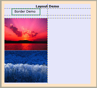
Figure 1: Layout Controls and child controls
Conclusion:
Thus, the article described various layout/container controls in Silverlight 2 and demonstrated how to create them.