The ListView is a hybrid control between a DataGrid and Repeater that combines the templating of the Repeater and the editing features of the data grid. The ListView is similar to the Repeater in that it allows one to define the layout of the HTML rendered to the browser, using various templates:
- LayoutTemplate - The root template that defines a container object, such as a table, div, or span element, that will contain the content defined in the ItemTemplate or GroupTemplate template. It might also contain a DataPager object.
- ItemTemplate - Defines the data-bound content to display for individual items.
- ItemSeparatorTemplate - Defines the content to render between individual items.
- GroupTemplate - Defines a container object, such as a table row (tr), div, or span element, that will contain the content defined in the ItemTemplate and EmptyItemTemplate templates. The number of items that are displayed in a group is specified by the GroupItemCount property.
- GroupSeparatorTemplate - Defines the content to render between groups of items.
- EmptyItemTemplate - Defines the content to render for an empty item when a GroupTemplate template is used. For example, if the GroupItemCount property is set to 5, and the total number of items returned from the data source is 8, the last group of data displayed by the ListView control will contain three items as specified by the ItemTemplate template, and two items as specified by the EmptyItemTemplate template.
- EmptyDataTemplate - Defines the content to render if the data source returns no data.
- SelectedItemTemplate - Defines the content to render for the selected data item to differentiate the selected item from other items.
- AlternatingItemTemplate - Defines the content to render for alternating items to make it easier to distinguish between consecutive items.
- EditItemTemplate - Defines the content to render when an item is being edited. The EditItemTemplate template is rendered in place of the ItemTemplate template for the data item that is being edited.
- InsertItemTemplate - Defines the content to render to insert an item. The InsertItemTemplate template is rendered in place of an ItemTemplate template at either the start or at the end of the items that are displayed by the ListView control. You can specify where the InsertItemTemplate template is rendered by using the InsertItemPosition property of the ListView control.
The ListView doesn't support paging, so the DataPager serves as an external control to provide paging features. The advantage of a separate control is that it gives more control about what the pager looks like and where it can be placed on the page. The DataPager class is used to page data and to display navigation controls for data-bound controls that implement the IPageableItemContainer interface.
DataPager control can be associated with the data-bound control by using the PagedControlID property. Alternatively, by putting the DataPager control inside the data-bound control hierarchy. For example, in the ListView control, DataPager control can be kept inside the ListView-LayoutTemplate.
The number of items that are displayed for each page of data can be customized by changing the PageSize property. The way a page is submitted to the server can be changed by setting the QueryStringField property.
Pager Fields
In order for the DataPager control to display navigation controls, pager fields are added to the control that are derived from the DataPagerField class.
|
Pager field type |
Description |
|
NextPreviousPagerField |
Enables users to navigate through pages one page at a time, or to jump to the first or last page. |
|
NumericPagerField |
Enables users to select a page by page number. |
|
TemplatePagerField |
Enables you to create a custom paging UI. |
To declaratively add pager fields to the DataPager control, add a Fields element to the DataPager control. You can then add the pager fields to the Fields element. The pager fields are added to the Fields collection in the order that they appear in the Fields element. The Fields collection enables you to programmatically manage the pager fields in the DataPager control.
Page Properties
The following table lists read-only properties of the DataPager control that specify characteristics of the page of data. These properties are usually used for binding expressions in the TemplatePagerField object.
|
Property |
Description |
|
MaximumRows |
The maximum number of records that are displayed for each page of data. |
|
StartRowIndex |
The index of the first record that is displayed on a page of data. |
|
TotalRowCount |
The total number of records that are available in the underlying data source. |
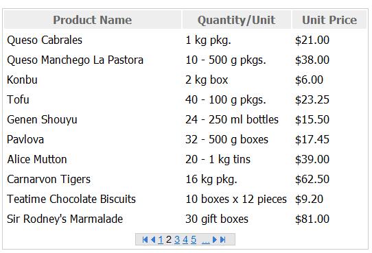
Let us create a small example using the Northwind database.
Create the Layout Template that will represent that how ListView will look
<LayoutTemplate>
<table class="tableInfo">
<tr>
<th width="250">
Product Name
</th>
<th width="150">
Quantity/Unit
</th>
<th width="100">
Unit Price
</th>
</tr>
<asp:PlaceHolder runat="server" ID="itemPlaceholder"></asp:PlaceHolder>
<tr>
<td colspan="3" align="center"><%--<asp:DataPager here>--%>
</td>
</tr>
</table>
</LayoutTemplate>
Create a ListView with ItemTemplate containing the fields that you want to show from Products table
<asp:ListView ID="ListView1" runat="server" DataSourceID="SqlDataSource1" ItemPlaceholderID="itemPlaceHolder">
<ItemTemplate>
<tr>
<td>
<%# Eval("ProductName") %>
</td>
<td>
<%# Eval("QuantityPerUnit") %>
</td>
<td>
<%# Eval("UnitPrice","{0:c}") %>
</td>
</tr>
</ItemTemplate>
</asp:ListView>
Put the DataPager inside the ListView Layout Template or anywhere on that page. Here I am putting the DataPager inside the Layout Template
<asp:DataPager ID="DataPager1" runat="server" PagedControlID="ListView1" PageSize="10" class="NavegationBar">
<Fields>
<asp:NextPreviousPagerField ButtonType="Image" FirstPageImageUrl="~/Images/Paging/FirstHover.gif" ShowFirstPageButton="true" PreviousPageImageUrl="~/Images/Paging/PreviousHover.gif" ShowLastPageButton="false" ShowNextPageButton="false" />
<asp:NumericPagerField ButtonCount="5" />
<asp:NextPreviousPagerField ButtonType="Image" ShowLastPageButton="true" ShowNextPageButton="true"
ShowPreviousPageButton="false" LastPageImageUrl="~/Images/Paging/LastHover.gif" NextPageImageUrl="~/Images/Paging/NextHover.gif" />
</Fields>
</asp:DataPager>