In this article we will see how to bind data in listbox from a XML file. The example application I built here will show the data from XML file and how to scroll the data after some time period.
The final output will be as shown below:
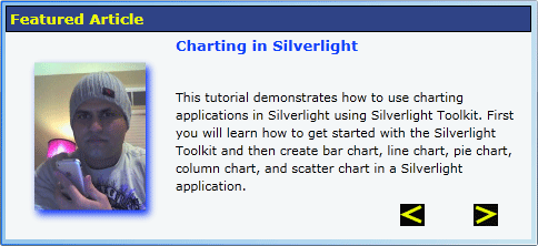
Here you can see the article detail coming along with the author image. I have provided two buttons to traverse to the next article description. Otherwise, the details get updated after a certain time frame.
Lets us first work on the design part of the control and then we will see the coding part.
We have added one listbox and two buttons for this application.
<ListBox x:Name="articleshow" Grid.ColumnSpan="2"
Width="484"
ScrollViewer.HorizontalScrollBarVisibility="Hidden"
ScrollViewer.VerticalScrollBarVisibility="Hidden" ItemTemplate="{StaticResource news1Template1}" ItemsSource="{Binding news1Collection}" Height="222" VerticalAlignment="Top"
SelectionChanged="SlideShow_SelectionChanged">
<ListBox.Background>
<LinearGradientBrush EndPoint="0.012,0.011" StartPoint="1.003,0.999">
<GradientStop Color="#FFF8F8F8" Offset="0"/>
<GradientStop Color="#FF0265F2" Offset="1"/>
</LinearGradientBrush>
</ListBox.Background>
<ListBox.ItemContainerStyle>
<Style TargetType="ListBoxItem">
<Setter Property="Width" Value="480"/>
<Setter Property="Height" Value="360"/>
</Style>
</ListBox.ItemContainerStyle>
</ListBox>
<Button x:Name="Previous" Content="Previous" Canvas.Left="92" Canvas.Top="268" Height="20" Margin="0,0,103,18" VerticalAlignment="Bottom" Click=" Previous_Click" HorizontalAlignment="Right" Width="22" Grid.Column="1" Template="{StaticResource ButtonControlTemplate1}" d:LayoutOverrides="HorizontalAlignment" Cursor="Hand" />
<Button x:Name="Next" Content="Next" Width="22" Canvas.Left="250" Canvas.Top="268" Height="20" HorizontalAlignment="Right" Margin="0,0,37,18" VerticalAlignment="Bottom" Click="Next_Click" Grid.Column="1" Template="{StaticResource ButtonControlTemplate2}" Cursor="Hand" />
Now let us style the button.
<ControlTemplate x:Key="ButtonControlTemplate1" TargetType="Button">
<Grid>
<VisualStateManager.VisualStateGroups>
<VisualStateGroup x:Name="FocusStates">
<VisualState x:Name="Focused"/>
<VisualState x:Name="Unfocused"/>
</VisualStateGroup>
<VisualStateGroup x:Name="CommonStates">
<VisualState x:Name="Normal"/>
<VisualState x:Name="MouseOver"/>
<VisualState x:Name="Pressed"/>
<VisualState x:Name="Disabled"/>
</VisualStateGroup>
</VisualStateManager.VisualStateGroups>
<Canvas Background="#FF060606">
<Path x:Name="arrow" Stroke="#FFE3FA06" StrokeThickness="3" Height="18.346" Margin="0,0,0,0" Width="16.686" RenderTransformOrigin="0.5,0.5" Data="M 1,1.5 L 4.5,5 L 8,1.5" UseLayoutRounding="False" Canvas.Left="2.907" Canvas.Top="0.327" Stretch="Fill">
<Path.RenderTransform>
<TransformGroup>
<ScaleTransform/>
<SkewTransform/>
<RotateTransform Angle="88.93"/>
<TranslateTransform/>
</TransformGroup>
</Path.RenderTransform>
</Path>
</Canvas>
</Grid>
</ControlTemplate>
The above XAML code is only for one button. Same is the code for other button.
Now let us see how to bind data in listbox from XML.
The xml for this application is:
<?xml version="1.0" encoding="utf-8" ?>
<news>
<news1 newsid="1" newstitle="Introduction of SPPersistedObject class" newsimage="Images/dhananjaycoder.jpg" newsdesc="In this article, I will give a high level introduction of SPPersistedObject class and its uses. I will give one sample also to explain uses of this class."/>
<news1 newsid="2" newstitle="Filtered TextBox in Silverlight 3" newsimage="Images/dpatra.jpg" newsdesc="In this article we will see how we can filter a Textbox on Keyboard inputs. "/>
<news1 newsid="3" newstitle="Charting in Silverlight" newsimage="Images/mahesh.jpg" newsdesc="This tutorial demonstrates how to use charting applications in Silverlight using Silverlight Toolkit. First you will learn how to get started with the Silverlight Toolkit and then create bar chart, line chart, pie chart, column chart, and scatter chart in a Silverlight application."/>
<news1 newsid="4" newstitle="Accordion Control in Silverlight 3" newsimage="Images/prv_new.jpg" newsdesc="In this article I will show you how to design the Accordion Control in Silverlight 3."/>
</news>
Now in expression blend open the "data" tab and select "Import sample data from XML".
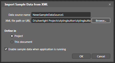
In the above screen select the XML file from the location and press OK.
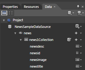
A new data source will be added to your application.
Now to bind this data source to our listbox. Drag it to listbox.
We will have the following XAML code for listbox.
<ListBox Height="100" Margin="14.5,0,-19,-169" VerticalAlignment="Bottom" Grid.Column="1" Grid.Row="1" DataContext="{Binding}" ItemTemplate="{StaticResource news1Template}" ItemsSource="{Binding news1Collection}"/>
The ItemTemplate code is as follows:
<DataTemplate x:Key="news1Template">
<StackPanel>
<TextBlock Text="{Binding newsdesc}"/>
<TextBlock Text="{Binding newsid}"/>
<Image Source="{Binding newsimage}" HorizontalAlignment="Left" Height="64" Width="64"/>
<TextBlock Text="{Binding newstitle}"/>
</StackPanel>
</DataTemplate>
We are now going to edit the ItemTemplate.
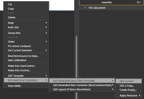
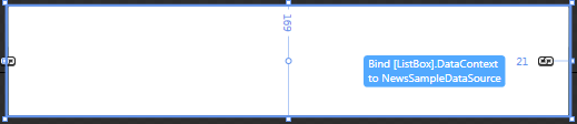
Right click the listbox and select the options shown in the above figure.
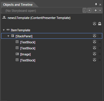
The below screen shows the default style of the ItemTemplate.
After some changes to my ItemTemplate code will be as follows:
<DataTemplate x:Key="news1Template1">
<Canvas Margin="0,0,-251,143" Background="#FFF4F7F8" x:Name="can1" Width="473">
<TextBlock Text="{Binding newsdesc}" Width="312" Canvas.Left="153" Canvas.Top="75" Height="57" TextWrapping="Wrap"/>
<Image Source="{Binding newsimage}" HorizontalAlignment="Left" Width="100" Height="180" Canvas.Left="26" Canvas.Top="28">
<Image.Effect>
<DropShadowEffect Color="#FF042DF9" BlurRadius="10"/>
</Image.Effect>
</Image>
<TextBlock Text="{Binding newstitle}" Width="312" Canvas.Left="153" Canvas.Top="28" FontWeight="Bold" FontSize="13.333" FontFamily="Verdana" Foreground="#FF0C41F8"/>
<Rectangle Fill="#FF2F4386" Stroke="Black" Height="24" Width="473"/>
<TextBlock Height="20" Width="144" Canvas.Left="4" Canvas.Top="2" FontSize="13.333" FontWeight="Bold" Foreground="#FFEEFA06" Text="Featured Article" TextWrapping="Wrap"/>
</Canvas>
</DataTemplate>
That's all for the XAML part of the code.
The code behind for the two button is as shown below:
private void Next_Click(object sender, RoutedEventArgs e)
{
articleshow.SelectedIndex++;
articleshow.ScrollIntoView(articleshow.SelectedItem);
}
private void Previous_Click(object sender, RoutedEventArgs e)
{
articleshow.SelectedIndex--;
articleshow.ScrollIntoView(articleshow.SelectedItem);
}
For automatic change of the content I use the DispatcherTimer class from the System.Windows.Threading namespace. The code will be as follows:
public MainPage()
{
// Required to initialize variables
InitializeComponent();
DispatcherTimer dt = new DispatcherTimer();
dt.Interval = new TimeSpan(0, 0, 0, 0, 5000);
dt.Tick += new EventHandler(news_change);
dt.Start();
}
void news_change(object sender, EventArgs e)
{
articleshow.SelectedIndex++;
}
Download the source code to know about its working.
That's it. Happy coding!