Introduction
In this section we will run through a quick FAQ for schedule management of software projects. We will run through WBS , how do we allocate resources, network diagrams like CPM and Pert, EST,LST,EFT,LFT, calculate deviations , monte-carlo , GANTT chart and lot. We are sure after this FAQ you will at least understand different project management concept in terms of schedule management.
Lately I have been writing articles and recording videos on design patterns, Estimation techniques like FPA and a dozen interview question series on C#, SQL Server, PM and Design patterns. If you want to download the videos and interview questions PDF it's all free at http://www.questpond.com. Do drop a note if you like my work.
Can you explain WBS?
WBS (Work Breakdown Structure) is a structured way of breaking / decomposing project in to various components. In one sentence WBS is a way to breakdown project in to logical lower level details. Below figure 'WBS' shows how a typical WBS looks like. There are six levels till where we can drill down and breakdown the job structure.
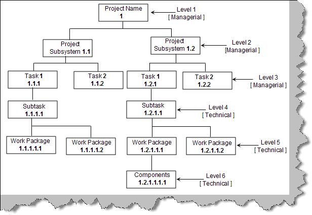
Figure: - WBS
Level 1:- The first level is the project name or the name of the assignment.
Level 2:- Level 2 represents the subsystem which will make up the project.
Level 3:- Level 3 shows the task to be performed to complete the subsystem from a managerial aspect.
Level 4:- The main task is further broken down in to sub tasks from a technical aspect.
Level 5:- This is the final deliverable also termed as work package.
Level 6:- These are components needed to form the work package.
From Level 1 to Level 3 are all managerial activities. From Level 4 to Level 6 are all technical activities.
Below figure 'WBS for CPU' shows detail breakdown for assembling a CPU of a computer.
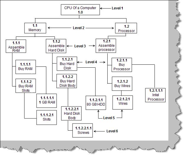
Figure: - WBS for CPU
Can you explain WBS numbering?
The first number in WBS denotes the project. For instance in figure 'WBS numbering' we have show the number '1' as the project number which is further extended according to level. Numbering and numeric and alphanumeric or combination of both. Figure 'Different Project Number' shows the project number is '528'
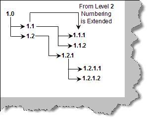
Figure: - WBS Numbering
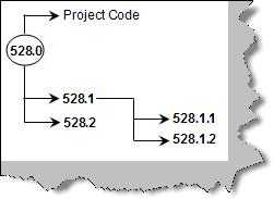
Figure: - Different Project Number
How did you do resource allocation?
This answer can vary from individual to individual. But here's how we think it should work. There are two steps for doing resource allocation:-
- Break up the project in to WBS and extract the task from the same. For instance below figure 'Task from WBS' shows how we have broken the accounting project in to small section and the final root is the tasks.
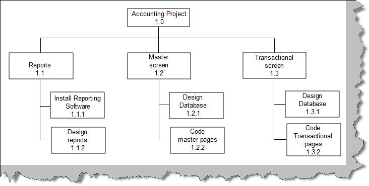
Figure: - Task from WBS
- Now the tasks at the final root are assigned to the resources. Table 'Assign task to resource' shows how the task are now allocated to resource.
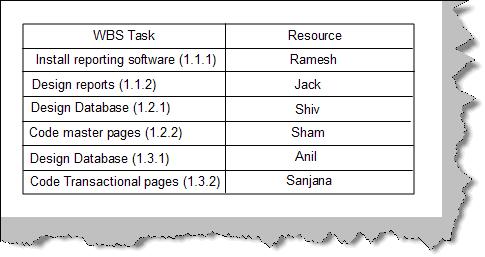
Figure: - Assign task to resource
Can you explain the use of WBS?
Below is a pictorial view of numerous uses of WBS.
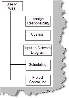
Figure: - Use of WBS
One of the main uses of WBS is for scheduling. WBS forms as a input to network diagrams from scheduling aspect.
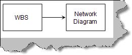
Figure: - WBS and Network
Can you explain network diagram?
Network diagram shows logical relationship between project activities. Network diagram helps us in the following ways:
- It helps us understand which activity is independent of other activity. For instance you can start coding/execution of transactional screens with out master screens being completed. This also gives an other view saying that you can execute both the activities in a parallel fashion.
- Network diagram also gives list of activities which can not be delayed. Like we can delay the master screens of a project, but not the transactional.
What are the different types of network diagram?
There are two types of diagrams:
- Activity on Arrow diagram ( Arrow diagram )
- Activity on Node diagram ( Precedence diagram )
AOA (Activity on Arrow) diagram
Before we understand what AOA is, let's consider the table below which has list of activities to start a computer institute. It has five columns below is description about the same:
- First column is just a sequence number for the activity.
- Second column is a short activity description,
- Third column has number of days needed to complete the activity.
- Fourth column describes which activity needs to be completed to start this activity
- Fifth column shows what the final output of the activity is.
| Activity No |
Activity Description |
Duration(Days) |
Pre-requisite |
Finished Activity |
| 0 |
Start project |
START |
START |
START |
| 1 |
Decide a location |
5 days |
0 |
Location Fixed |
| 2 |
Sign the lease |
1 day |
1 |
Agreement Signed |
| 3 |
Paint Interior |
3 days |
2 |
Interior Ready |
| 4 |
Fix Furniture |
20 |
3 |
Institute Finished |
| 5 |
Get Faculties |
6 days |
0 |
Recruitment done |
| 6 |
Prepare Course Material |
10 days |
8 |
Course designed |
| 7 |
Buy Computers |
2 days |
5 |
Computer bought |
| 8 |
Install Software |
1 day |
7 |
Software Installed |
| 9 |
Advertise |
2 days |
3 |
Ad displayed in news paper |
| 10 |
Enroll Students |
1 day |
9 |
Student enrolled |
| 11 |
Start Batch |
END |
END |
END |
Table: - Computer institute Activity list
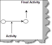
Figure: - AOA
As the name suggests Activity on Arrow (i.e. AOA) which means arrows represent activity and the nodes represent finished activities. Figure 'AOA' represents how the activity is shown on the arrow and how the node shows the finished activity. So the node represents completed activities and arrows represent activities.
So let's join the activities and nodes defined in table 'Computer Institute Activity List'. Figure 'AOA for Computer Institute' shows how the AOA diagram is built. We have put the activities on the arrow and the nodes represent the finished activity. On the arrow itself we have put the number of days for every activity.
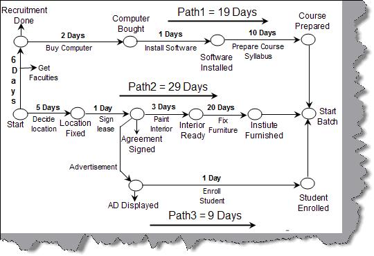
Figure: -AOA for Computer Institute
AON (Activity on Node) diagram
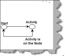
Figure: - AON
In AOA we view Activity on arrow while in AON we view Activity on the Node. So the change of thinking shifts from viewing activities as events (AON) rather than activities happening between milestones.
Figure 'AON' represents the same in a pictorial manner. Below is the same redrawn AON diagram for the computer institute activity.
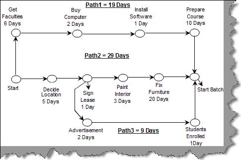
Figure: - AON for Computer Institute
What is the advantage of using network diagrams?
Network diagrams help us in the following ways:
- Helps us find our critical / non-critical activities. So if we know our critical activities we would like to allocate our critical people on the critical task and medium performing people on the non-critical activities.
- This also helps us to identify which activities we can run in parallel, thus reducing the total project time.
Can you explain Arrow diagram and Precendence diagram?
AOA (discussed previously) is nothing but Arrow Diagram and AON (as discussed in the previous question) is nothing but precendence diagram.
What are the different types of Network diagrams?
As discussed in the previous section we have two types of network diagrams one is AON (Activity Networks) and other is AOA (Arrow Networks). Below figure 'Types of Network Diagrams' shows the classification in a more visual format. CPM / CPA (Critical Path Method / Critical Path Analysis) and PERT (Program Evaluation and Review Technique) come under Arrow networks. PDM (Precedence Diagrams) comes under activity diagram.
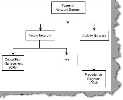
Figure: - Types of Network Diagrams
Can you explain Critical path?
CPA / CPM (Critical path analysis / method) are an effective way to analyze complex projects. A project consists of set of activities. CPA represents the critical set of activities to complete a project. Critical path helps us to focus on essential activities which are critical to run the project. Once we identify the critical activities we can devote good resources and prioritize the same accordingly. CPA also gives us a very good basis for scheduling and monitoring for progress. One of the most important thing it does is allows the project manager to concentrate on important activities.
Critical Path is the path which takes the longest time. In the above example we have three paths (please refer AOA for computer institute or AON for computer institute in the previous questions) path1, path2 and path3. Let's sum up the number of days allocated on those paths, so path1 = 19 days, path2 = 29 days and path3 = 9 days. Both figures also show the number of days required on the path.
So path2 is the longest path on the network diagram and also the most important path. In short path2 is the critical path and this method is termed as Critical Path Method /Analysis. Putting in other words the task on the critical path needs careful monitoring and any delays on the critical path will lead to delay of the project. You can easily visualize from the CPM diagram that we if we do not decide location, sign a lease, fix interior and paint we will not have the actual institute at place in given time span.
Can you define EST, LST, EFT, LFT?
CPM (Critical Path Method) uses the following times for an activity.
- (EST)Early start Time is the earliest time the activity can begin.
- (LST)Late start Time is the latest time the activity can begin and still allow the project to be completed on time.
- (EFT) Early finish Time is the earliest time the activity can end.
- (LFT) Late finish Time is the latest time the activity can end and still allow the project to be completed on time.
We will use the same example of the computer institute described in the previous example for calculating and understanding EST and EFT.
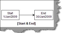
Figure: - Start and End
According to CPM calculation the start date should be minimum 1-Jan-2009 and maximum end date is 30-jan-2009. Our EST, EFT, LST and LFT should fall between these lines.
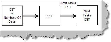
Figure: - Forward Calculation
First we need to calculate EST and EFT. EST and EFT are calculated using the forward pass methodology. Figure 'EST and EFT' shows how the forward calculation works. We add "0" to the start date i.e. 1-Jan-2009 which becomes the EST of 'Get Faculties'. 'Get Faculties' task takes the 6 days and adds to EST which gives us 7-Jan-2009 which is the EFT for 'Get Faculties'. EFT becomes the EST of the next task i.e. 'Buy Computers'. Again we add number of days of 'Buy Computers' task to get EFT and so on. In short EFT is calculated by subtracting number of days from EST. EFT of this task becomes the EST of the next task.
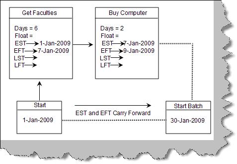
Figure: -EST and EFT
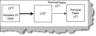
Figure: - Backward Calculation
In order to calculate LST and LFT we need to calculate backward from the dead line date.
Figure 'LST and LFT' show how the calculation actually happens. As concluded previously the latest date till which the institute should be ready is 30-Jan-2009. The latest dead line date becomes the LFT of the last activity i.e. 'Prepare Course'. We subtract the number of days from the LFT and get LST of 'Prepare Course' activity which is 20-Jan2009. LST of this activity becomes the LFT of the activity which needs to finish before this i.e. 'Install Software' and so on. Figure 'Backward Calculation' shows how the calculation moves. LST of the current task is LFT minus number of days. Current Activity LST is then assigned to the previous task's LFT.
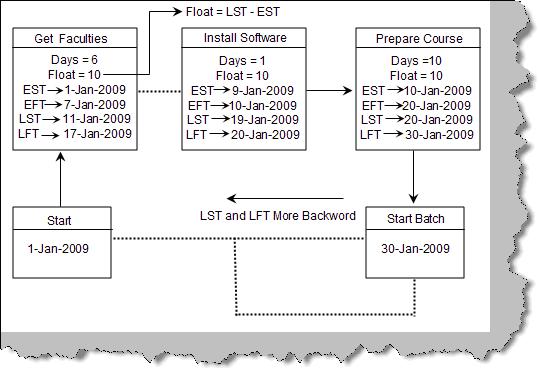
Figure: -LST and LFT
Below figure 'EST, EFT, LST and LFT' shows the complete figure after the full calculation forward and backward.
Note: - Try calculating manually to understand how we reached to every figure in the diagram below. In real time scenario you will be using a tool…So do not worry. But you should understand the concept that's important.
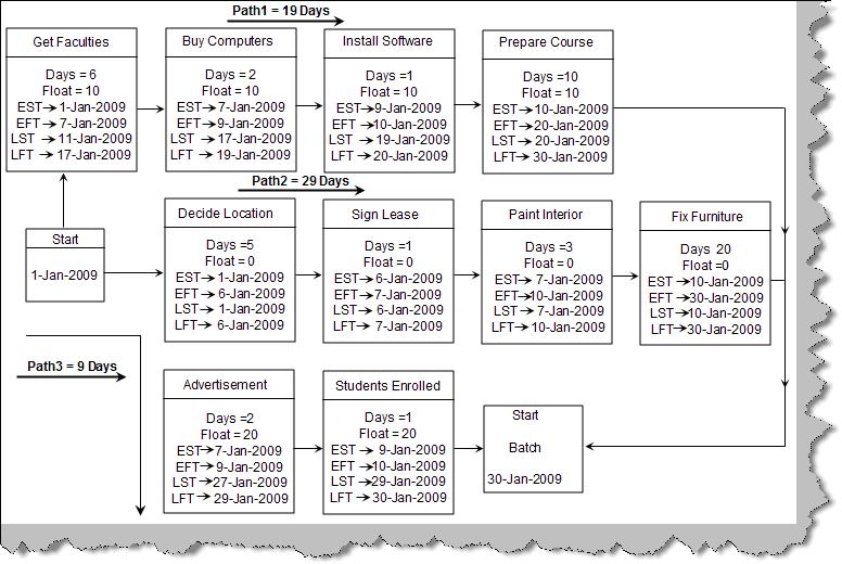
Figure:- EST, EFT, LST and LFT
Can you explain Float and Slack?
Float (also known as slack, total float and path float) is computed for each task by subtracting the EFT from the LFT (or the early start from the late start). Float is the amount of time the task can slip without delaying the project finish date. Free float is the amount of time a task can slip without delaying the early start of any task that immediately follows it. In the previous question figure 'EST, EFT, LST and LFT' we have computed the float for every activity. For instance 'Get Faculties' has a slack of 10, 'Advertisement' task has a slack of 20 days and so on.
Can you explain PERT?
PERT is again a network diagram. In CPM the activity durations are based on historic data which has been performed many times. But what if an activity is not performed and this is the first time the activity is performed in the organization, that's when PERT comes to help. CPM is used when the time lines of the activities are determestic while PERT is used when the timelines are not determestic.
PERT uses three time estimates to come to a conclusion regarding time estimates for a activity.
- Optimistic Time :-It's the shortest time in which the activity can be completed.
- Pessimistic Time :-It's the longest time an activity might require.
- Most Likely Time (m):-It's the completion time which has the highest probability.
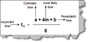
Figure: - PERT Computations
Now using the above three estimates we can calculate the expected time. Figure 'Pert Computations' shows the formulae in more detail where 'a' is the optimistic time, 'b' is the pessimistic time, 'm' the most likely and 'te' the expected time.
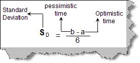
Figure: - Standard Deviation
Other than expected time there are two more important formula's one is calculating the 'standard deviation (Sd)' and the other is 'total standard deviation (St)'. Both the formulas are given in the figure 'Standard Deviation' and 'Total Standard Deviation'. Terminology 'a','b' and 'c' remain same. SA1, SA2 are standard deviations which are calculated on the individual activity.
Let's not talk about theory and let's apply the above fundamentals to our institute project. What we will do is apply the PERT fundamentals to two different probabilities only on the CPM path of the computer institute. Below figure shows the two probability and the calculations. We can see from the calculations the two probabilities one and two. We can also see the standard deviation of probability one is less than probability two. So probability one has more stability and can hence become our valid plan. Apply the formulas (PERT, Te, Sd and St) explained previously to the diagram.
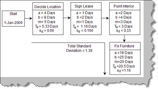
Figure: - Probability One
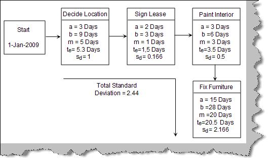
Figure: -Probability Two
Note: - We use PERT when we have not performed that activity any time before. We use CPM when we have history about the acitivity and we have perfomed the activity atleast once. So a project manager should be aware of when to use both the diagrams.
Can you explain GANTT chart?
GANTT chart is a time and activity bar chart. Gantt charts are easy-to-read charts that display the project schedule in task sequence and by the task start and finish dates. Gantt charts are simple chart which display the project schedule in task sequence and by the task start and finish dates. Lets consider the below given simple four activity network figure.
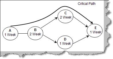
Figure: -Simple Activity Network
We have circled the activity and also mentioned the time duration required in weeks. For instance Activity A requires 1 week, Activity B requires 2 weeks and so on. Now let's construct a simple GANTT chart for the simple network activity diagram. GANTT chart is an illustration of time and activities. Below figure 'GANTT CHART' is how the network activity will look when viewed in GANTT chart format. In GANTT chart we put down the activities in the vertical axis and the time scale on the horizontal axis. So on the vertical axis we have listed down 'Task A', 'Task B', 'Task C' and so on. While on the horizontal axis we have listed down the time in weeks. There is one more column duration added for reference. One the most important component in GANTT chart is the activity bar which represents an activity. Below figure 'Activity Bar' shows how we represent an activity. The start of the activity is represented by a top arrow and the end by a down arrow.
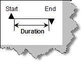
Figure: -Activity Bar
So we list down all activities and start drawing the activity bar according to duration. Once done the final output is as shown in figure 'GANTT chart'. The top bar shows the total activity period. Dependencies are shown by one arrow connecting to the other arrow; we have circled how the dependencies are shown. Task B can only start if task A is completed. GNATT chart is a helpful way to communicate schedule information to top management since it provides an easy-to-read visual picture of the project activities.
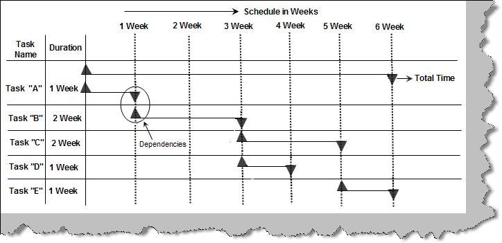
Figure: -GANTT Chart
what is the disadvantage of Gantt chart?
It does not show clear dependencies/relationships between tasks, for instance, which task comes first, then second, and so on. It also fails in showing the critical and non-critical tasks. GANTT chart is best used to show summary of the whole project to the top management as it does not show detail information for every activity.
What is Monte-Carlo simulation?
Monte-Carlo helps us to forecast future models depending on range of possible inputs. For instance to complete a project we might have different range of time minimum time, maximum time and estimated time. Monte-carlo simulation runs over these ranges of input values and gives us different possibilities the project can end up to. It can tell you depending on these ranges what are the possible outcomes.
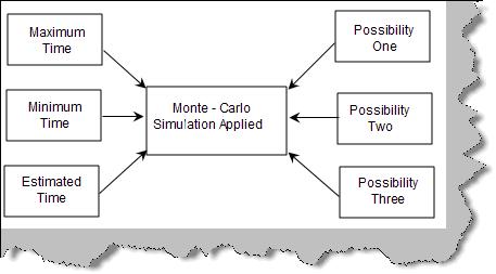
Figure: - Monte-Carlo Applied
In Monte-Carlo simulation random value is selected from the range and possibility / model is generated. This model is saved and then the second random value is selected and so on. For instance consider the below figure 'Task1 and Task2'. 'Task2' can be finished only when 'Task1' is completed. We have also chosen the min and max range in which both the task can be completed. 'Task1' can be completed in a minimum time of 1 day and maximum of 3 days. 'Task2' can be completed in minimum 2 days and in maximum 4 days.
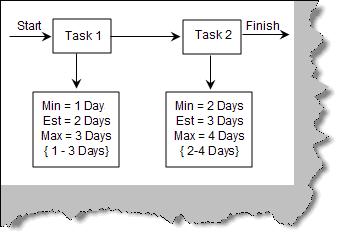
Figure: - Task1 and Task2
Now let's apply Monte Carlo simulation. Below figure 'Monet Carlo on Both Tasks' shows the different combinations.
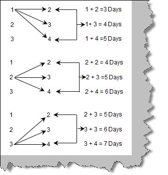
Figure: - Monte Carlo on Both Tasks
Now let's collect the number of times the days have occurred. Below figure 'Number of Possibilities' shows that 5 days has occurred the most times. There is a high possibility that task1 and task2 will be completed in 5 days.
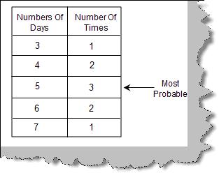
Figure: - Number of possibilities