In this article we will walk through a basic sample for using the Popup control in Silverlight 2.0.
Typically the popup control is used to display some temporary and additive information, optionally allowing the user to provide a short response.
A popup is displayed within the bounds of the Silverlight plug-in and is the top level element - shown on top of the existing content. Note that the transforms applied to the Parent control of the Popup will be applied to the Popup control too.
Some scenarios where using popups would be a good choice are
-
Confirmation message box
-
Detail view of row data.
-
Quick Selections
Options for creating and using Popups
Option 1 - Add controls to the Popup object using XAML
Option 2 - Add controls to the Popup object using Code
Option 3 - Design a separate user control which will be included as the content of the Popup control.
In the sample we will create a new Silverlight user control. The user control will contain the controls and layout to be rendered for the Popup. This provides a good separation of logic and offers an opportunity of re-usability.
User control : UCApproveConfirm.xaml
<UserControl x:Class="SilverlightApplication1.ApproveConfirm"
xmlns="http://schemas.microsoft.com/winfx/2006/xaml/presentation"
xmlns:x="http://schemas.microsoft.com/winfx/2006/xaml"
Width="400" Height="100">
<Border BorderThickness="5" BorderBrush="Black">
<Grid x:Name="ucGrid" Background="Beige">
<Grid.RowDefinitions>
<RowDefinition/>
<RowDefinition/>
</Grid.RowDefinitions>
<Grid.ColumnDefinitions>
<ColumnDefinition/>
<ColumnDefinition/>
</Grid.ColumnDefinitions>
<TextBlock Margin="5"
Text="Are you sure you want to approve all the Incidents?" Grid.Column="0" Grid.Row="0" Grid.ColumnSpan="2"/>
<Button Width=" 60" Height="30" Content="Yes" Click="Button1_Click" Grid.Column="0" Grid.Row="1"/>
<Button Width=" 60" Height="30" Content="No" Click="Button2_Click" Grid.Column="1" Grid.Row="1"/>
</Grid>
</Border>
</UserControl>
In the code behind for the user control we would add code to handle the user selection.
In this example, we will only add some code to "close" the Popup.
private void Button1_Click(object sender, RoutedEventArgs e)
{
this.Visibility = Visibility.Collapsed;
}
Now we make use of the User control to display the popup. The popup will be displayed when the "Approve All" button is clicked.
We first import the System.Windows.Controls.Primitives namespace.
In the Page code:
using System.Windows.Controls.Primitives;
In this basic sample, we will just add a button, which on being clicked, will display the user control within a popup.
In the Page xaml:
<StackPanel x:Name="mainPanel">
<Button x:Name="btnPopup" Width="100" Click="btnApproveAll_Click"
Content="Approve All"></Button>
</StackPanel>
To display the Popup, we create a Popup object and set the User control as the Child of the Popup. We also add a small horizontal and vertical offset to improve the visibility/layout. As per Microsoft documentation: "To avoid a runtime error, add the Popup to the visual tree by declaring it in XAML or by calling LayoutRoot.Children.Add(popupInstance)."
In the Page code:
Popup popupConfirmation;
private void btnApproveAll_Click(object sender, RoutedEventArgs e)
{
popupConfirmation = new Popup();
popupConfirmation.Child = new ApproveConfirm();
this.mainPanel.Children.Add(popupConfirmation);
popupConfirmation.HorizontalOffset = 25;
popupConfirmation.VerticalOffset = 25;
popupConfirmation.IsOpen = true;
}
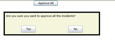
Image: The Popup confirmation box in action.
Note: You cannot nest a Popup control within another Popup.
Conclusion: In this article we demonstrated the use of the Popup control in Silverlight. It provides significant user interaction in a very intuitive way.
Happy Coding!