Introduction:
Microsoft Expression Blend 2 is a design tool that allows you to create fantastic user interfaces for Silverlight applications. Although Expression Blend does not support direct event handling, it allows you to trap user interactions and respond to them through the use of the Interaction window and visual states.
Let's see how you can do this:
In Blend, you can change the appearance of controls in different states depending on user interaction. For example, if you want that a pale yellow colored button should appear pale purple on the click of a mouse or on mouse hover, Blend allows you to do this.
"MouseClick" and "MouseOver"" are some states of a button.
It is possible to customize the appearance of different states of controls using this feature of Blend. The biggest advantage here is that you don't need to write a single line of code for this. Everything can be done using menus and various panes.
First, you will need to create a reusable template for the control. A reusable template is a copy of the default template which can be modified as per requirements. The default template itself cannot be modified in any way.
Let us assume that you have created a Shopping Store application and want to customize the appearance of the Submit button depending on user interaction.
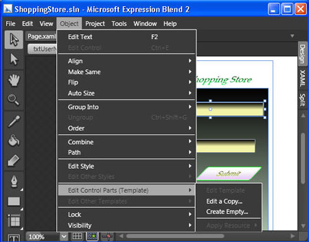
Click the Object menu and select Edit Control Parts (Template) as shown in Figure 1.

Figure 1
Select Edit a Copy. This will open the Create Style Resource dialog box as shown in Figure 2.

Figure 2
A default name is specified for the style resource. Once this template has been created, you can edit or modify it as desired and also specify the states in which this template has certain appearances.
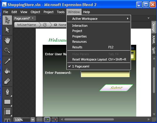
To open the Interaction pane, click the Window menu and select Interaction.

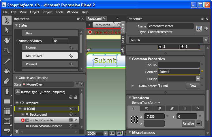
Figure 3
The Interaction pane shows several elements- States, Common States, Objects and Timeline. The States group element shows the states of a control. For system controls such as buttons, default state groups and states are already present; you cannot add new state groups or add states. However for some other controls such as user controls you can create your own custom state groups.
The States pane displays the default appearance of the objects. After you start recording various states, whenever you want to exit the state-recording mode, you have to select Base.
Select MouseOver in the CommonStates group. In the Object and Timelines group, select contentPresenter. The red circle that appears at the top of the artboard indicates that state recording is on. As long as state recording is on, any property changes that you make will be recorded for that selected state. The red circles around the expander buttons indicate the parts of the template that have changed properties as compared to when Base is selected.

Figure 4
To render the button as skewed in the MouseOver state, click [Grid] under Objects and Timeline. In the Properties panel, under Transform, specify the coordinates. To end the state recording, select Base.
Build and test the application. When the application opens in a browser window, move your mouse pointer over the button and you can see it skewed.
Conclusion: Thus, you learnt how to capture user interactions in a Silverlight application with Expression Blend.