There is no denying that glass and plastic buttons are becoming very popular. Some sites feature single glass buttons to draw visitor attention to a special area of the page, while others form the entire navigation system for a site.
Glass buttons can add a lot of color to a page without carrying heavy visual weight. Creating these buttons is very quick and easy in Microsoft Expression Blend.
In this article I am going to create a Glass Button in Blend with the help Of Ellipses. We can use Rectangles also.
Step1: Open a new project of WPF type in Expression blend with C# as language and name it as GlassButton.
Step2: Change the window to a page by changing the code as:
xaml :
<Page
xmlns="http://schemas.microsoft.com/winfx/2006/xaml/presentation"
xmlns:x="http://schemas.microsoft.com/winfx/2006/xaml"
xmlns:d="http://schemas.microsoft.com/expression/blend/2008" xmlns:mc="http://schemas.openxmlformats.org/markup-compatibility/2006"mc:Ignorable="d"
x:Class="EXPBLD4.Page1"
x:Name="Page"
WindowTitle="Page"
FlowDirection="LeftToRight"
Width="640" Height="479">
</Page>
xaml.cs
namespaceGlassButton
{
publicpartialclass Page
{
public Page()
{
}
}
}
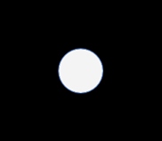
Step3: Set the layoutroot background to "Black". Select an Ellipse from the tools pane and draw it on your Artboard pressing Alt+Sft to get good shape of your Circle also rename it as "ONE".
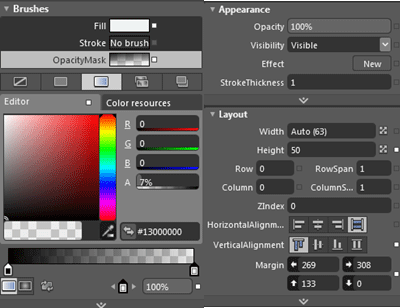
Step4: While the circle is selected set its Fill to "Red", click on the No Brush tab to remove the stroke. Now Copy-paste the circle and rename it to "A1", change its Fill to a Gradient brush. Again Change the gradient to a Radial gradient and adjust its properties as shown in the following code:
Code:
<Ellipse Margin="262,160,301,0" Height="48"VerticalAlignment="Top">
<Ellipse.OpacityMask>
<RadialGradientBrush>
<GradientStop Color="Black"/>
<GradientStop Offset="1"/>
</RadialGradientBrush>
</Ellipse.OpacityMask>
<Ellipse.Fill>
<LinearGradientBrushEndPoint="0.148,0.175"StartPoint="0.852,0.825">
<GradientStop Color="#FFEDF3F2" Offset="0"/>
<GradientStop Color="#FFEDF3F2" Offset="1"/>
</LinearGradientBrush>
</Ellipse.Fill>
</Ellipse>
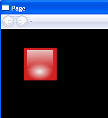
Your Page will be like this now:
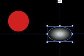
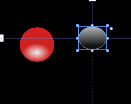
Step5: Adjust the second circle in the Bottom of the First circle like this:
Step6: Copy-Paste one more circle and name it "A2". Change the properties of the A2 circle in the brushes section.
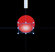
Step7: Adjust the third circle on the top of the first circle like this:
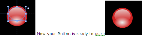
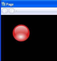
Running Window:
The xaml code is as under:
<Pagexmlns="http://schemas.microsoft.com/winfx/2006/xaml/presentation"
xmlns:x="http://schemas.microsoft.com/winfx/2006/xaml"
xmlns:d="http://schemas.microsoft.com/expression/blend/2008"
xmlns:mc=http://schemas.openxmlformats.org/markup-compatibility/2006
mc:Ignorable="d" x:Class="EXPBLD4.Page1" x:Name="Page"
WindowTitle="Page"FlowDirection="LeftToRight"Width="640" Height="480"
WindowWidth="640"WindowHeight="480">
<Page.Triggers>
<EventTriggerRoutedEvent="FrameworkElement.Loaded"/>
</Page.Triggers>
<Grid x:Name="LayoutRoot">
<Grid.Background>
<LinearGradientBrushEndPoint="0.5,1"MappingMode="RelativeToBoundingBox"
StartPoint="0.5,0">
<GradientStop Color="White" Offset="1"/>
<GradientStop Color="#FFAC74DE"/>
</LinearGradientBrush>
</Grid.Background>
<Ellipse Margin="51.5,35,0,0" Height="75"VerticalAlignment="Top" Width="80" HorizontalAlignment="Left" d:LayoutOverrides="Width">
<Ellipse.Fill>
<LinearGradientBrushEndPoint="0.148,0.175"StartPoint="0.852,0.825">
<GradientStop Color="#FFFF0606" Offset="0"/>
<GradientStop Color="#FFE93911" Offset="1"/>
</LinearGradientBrush>
</Ellipse.Fill>
</Ellipse>
<Ellipse Margin="52,69,0,0" Height="48"VerticalAlignment="Top"HorizontalAlignment="Left" Width="77">
<Ellipse.OpacityMask>
<RadialGradientBrush>
<GradientStop Color="Black"/>
<GradientStop Offset="1"/>
</RadialGradientBrush>
</Ellipse.OpacityMask>
<Ellipse.Fill>
<LinearGradientBrushEndPoint="0.148,0.175"StartPoint="0.852,0.825">
<GradientStop Color="#FFEDF3F2" Offset="0"/>
<GradientStop Color="#FFEDF3F2" Offset="1"/>
</LinearGradientBrush>
</Ellipse.Fill>
</Ellipse>
<Ellipse Margin="60,42,0,0" Height="50"VerticalAlignment="Top"HorizontalAlignment="Left" Width="63">
<Ellipse.OpacityMask>
<LinearGradientBrushEndPoint="0.503,0.826"StartPoint="0.468,-0.287">
<GradientStop Color="Black" Offset="0"/>
<GradientStop Color="#14FFFFFF" Offset="1"/>
</LinearGradientBrush>
</Ellipse.OpacityMask>
<Ellipse.Fill>
<LinearGradientBrushEndPoint="0.192,0.11"StartPoint="0.808,0.89">
<GradientStop Color="#FFEDF3F2" Offset="0"/>
<GradientStop Color="#FFEDF3F2" Offset="1"/>
</LinearGradientBrush>
</Ellipse.Fill>
</Ellipse>
</Grid>
</Page>
Similarly we can create rectangular buttons also and for that we have to replace Ellipse with Rectangle from our code:
We can also create different Buttons of different colors with the same procedure so that the result would be:
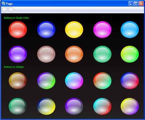
Note: you can create a shaded button by using the Gradient Brush
Now it's time to work on the MouseOver and MousePressedState :
-
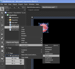
Select all the three circles and Group in to a border:
-
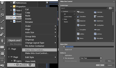
Now Change the border to Button Control by right clicking on Border-> Make Into Control, a pop up of Make Into Control appeared click ok and set the content of your button control as Blank (means no content should be written):
-
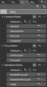
Now if you will notice the States pane, you can see different states associated with a button. Like the following figure :
-
In the above figure we have a Base state. Base state is the original state of the Control. And further we have three different categories of states called as Common States, Focus States and Validation States. We will now change the MouseOver and Pressed States.
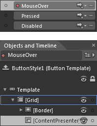
First click on the MouseOver State and you will get the following changes:
-
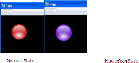
Change the Gradient of the first circle to see the MouseOver Effect and press Ctrl+F5; if you have done your work correctly then your window should be like this:
-
Similarly click on the Pressed State and Change the Gradient of the first circle. The changes occurred are as under :
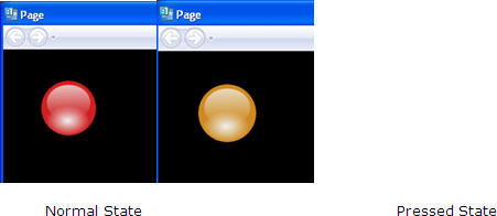
Normal State Pressed State
Code MouseOver State :
<VisualStateManager.VisualStateGroups>
<VisualStateGroup x:Name="CommonStates">
<VisualState x:Name="Normal"/>
<VisualState x:Name="MouseOver">
<Storyboard>
<ColorAnimationUsingKeyFramesStoryboard.TargetProperty="(Shape.Fill).(SolidColorBrush.Color)"Storyboard.TargetName="ONE">
<EasingColorKeyFrameKeyTime="0" Value="#FF7620D0"/>
</ColorAnimationUsingKeyFrames>
</Storyboard>
</VisualState>
Code MousePressed State :
<VisualState x:Name="Pressed">
<Storyboard>
<ColorAnimationUsingKeyFramesStoryboard.TargetProperty="(Shape.Fill).(SolidColorBrush.Color)"Storyboard.TargetName="ONE">
<EasingColorKeyFrameKeyTime="0" Value="#FFD08920"/>
</ColorAnimationUsingKeyFrames>
</Storyboard>
</VisualState>
</VisualStateGroup>
</VisualStateManager.VisualStateGroups>