ASP.NET 3.5 Calendar control creates a functionally rich and good looking calendar box that shows one month at a time. The user can move from month to month, select a date, and even select a range of days. The calendar control has many properties like you can change foreground color , background color, font, title, format of date, currently selected date and so on.
Use the Calendar control to display a single month of a calendar on a Web page. The control allows you to select dates and move to the next or previous month. The Calendar control supports all the System.Globalization. Calendar types in the System.Globalization namespace. Apart from the Gregorian calendar, this also includes calendars that use different year and month systems, such as the Hjiri calendar. You can specify whether the Calendar control allows you to select a single day, week, or entire month by setting the SelectionMode property. By default, the control displays the days of the month, day headings for the days of the week, a title with the month name and year, links for selecting individual days of the month, and links for moving to the next and previous month. You can customize the appearance of the Calendar control by setting the properties that control the style for different parts of the control. The following table lists the properties that specify the style for the different parts of the control.
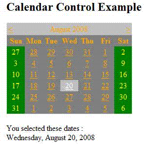
Note: The important Calendar event is SelectionChanged which fires every time a user clicks a date. Here is a basic event handler that responds to the SelectionChanged event and displayes the selected date.
There are nine events in calendar control.
- DayRender - Occurs when each day is created in the control hierarchy for the Calendar control.
- SelectionChanged - Occurs when the user selects a day, a week, or an entire month by clicking the date selector controls.
- VisibleMonthChanged - Occurs when the user clicks on the next or previous month navigation controls on the title heading.
- DataBinding - Occurs when the server control binds to a data source.
- Disposed - Occurs when a server control is released from memory, which is the last stage of the server control lifecycle when an ASP.NET page is requested.
- Init - Occurs when the server control is initialized, which is the first step in its lifecycle.
- Load - Occurs when the server control is loaded into the Page object.
- PreRender - Occurs when the server control is about to render to its containing Page object.
- Unload - Occurs when the server control is unloaded from memory.
Here is ASP.NET code that creates a calendar control. And the selection changed event is below that.
<h2>Calendar Control Example</h2>
<asp:Calendar ID="Calendar1" runat="server" ForeColor="Orange"
BackColor="Gray" ondayrender="Calendar1_DayRender"
onselectionchanged="Calendar1_SelectionChanged"></asp:Calendar>
<br />
<asp:Label ID="DatesLabel" runat="server"></asp:Label>
protected void Calendar1_SelectionChanged(object sender, EventArgs e)
{
DatesLabel.Text = "You selected these dates : <br />";
foreach (DateTime dt in Calendar1.SelectedDates)
{
DatesLabel.Text += dt.ToLongDateString() + "<br />";
}
}
protected void Calendar1_DayRender(object sender, DayRenderEventArgs e)
{
if (e.Day.IsWeekend)
{
e.Cell.BackColor = System.Drawing.Color.Green;
e.Cell.ForeColor = System.Drawing.Color.Yellow;
e.Day.IsSelectable = false;
}
}
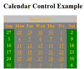
Here is Output:

Figure 1.
After selection any date:

Figure 2.
This is it.