Introduction:
Let us see a simple primer on how to work with various property groups that you see in the Blend IDE.
To begin with, you will create a Silverlight 2.0 project in Blend. Then, click on Window ->Properties to open the Properties pane. If you have one or more controls created in Page.xaml, you will see a wide range of property headings that group and classify related properties. These are more or less similar for most controls with a few changes here and there. Each heading can be expanded by clicking on the arrow.
The property headings commonly seen for most controls are:
-
Brushes
-
Appearance
-
Layout
-
Common Properties
-
Transform
We shall examine these property groups as we explore further.
Drag and drop a TextBlock control in the white designer area (also called artboard) in Blend IDE. Rename the TextBlock control to txtblkHeading and set the text as "Welcome to Shoreline Shopping Store".
Properties for the TextBlock control include the standard set of brushes available for most controls:
-
No Brush
-
Solid Brush
-
Gradient Brush
-
Tile Brush
These are represented by the square icons that you see in Figure 1. (highlighted here in red just so that you may easily identify them).
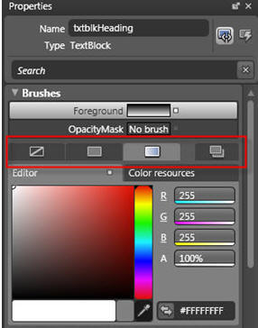
Figure 1: Default Brush values
By changing these properties, you can manipulate the appearance of a control with respect to its foreground and/or background. For example, a TextBlock control does not have a Background property but has only a Foreground property.
Change the Foreground property as shown in Figure 2. To set a particular hue for the gradient, click on the eye dropper tool and select a color from the large colored area.
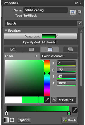
Figure 2 : Setting Brush values
Appearance: Properties in this category include Opacity and Visibility. Opacity is set to 100% by default. Visibility is set to Visible by default.
Layout
This property group represents the physical layout and positioning of the control.
The default values for this group are listed in the table:
|
Name |
Default Value |
|
Width |
Auto |
|
Height |
Auto |
|
Row |
0 |
|
Column |
0 |
|
RowSpan |
1 |
|
ColumnSpan |
1 |
|
ZIndex |
Represents the order on the z-plane in which the element appears. |
|
HorizontalAlignment |
Left, Center, Right, Stretch |
|
VerticalAlignment |
Top, Center, Bottom, Stretch |
|
Margin |
for each of the four edges of the TextBlock control |
Table 1
Common Properties
This property group represents the common set of properties that are present for most controls. These are listed in the table:
|
Property Name |
Description |
|
ToolTip |
This property defines the tooltip object that will display the tooltip for the control. |
|
Text |
This property specifies the actual text that will appear in the control. |
|
Cursor |
Indicates the cursor that is displayed when the mouse cursor is over this control. |
|
DataContext |
Specifies or retrieves the data context for an element when it takes part in data binding. This property allows controls to inherit the data sources and other settings from parent controls or elements. |
|
IsHitTestVisible |
This property is represented as a checkbox and is internally set to a boolean value to indicate whether the TextBlock control can be returned as a hit test result from some portion of its rendered or displayed content. |
|
Tag |
Indicates an object that can be used to store custom information about the control. |
Table 2
Text
This property group is further divided into three sub categories:
Font: This property comprises of font family, font size, font style, embedding, static and dynamic subsets that allow you to specify how to embed the characters in this element.
Paragraph:
LineHeight
Paragraph spacing before
Paragraph spacing after
Text alignment: By default, this is Left but can be changed to Center or Right.
Line Indent
Left Indent
Right Indent
First Line Indent
The next property group is Transform, which controls the transformation of the control. Following are the sub categories under this group:
RenderTransform
Translate
Rotate
Scale
Skew
CenterPoint
Flip
This property provides you three options to choose from:
|
Flip X Axis |
|
Flip Y Axis |
|
Render Transform |
Specify the values for the Transform group as shown in Figure 3.
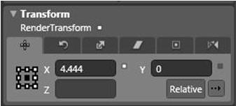
Figure 3.
This will cause the TextBlock to be skewed as shown in the Figure 4.
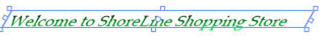
Figure 4
The next property group is:
Miscellaneous
It comprises miscellaneous properties as listed below:
Clip: This is used to set the geometry that is used to define the outline of the contents of an element
FontSource: Indicates the font source
Inlines: This is a collection of inline text
RenderTransformOrigin: Used to specify coordinates for rendering transforms
Style: Used to set styles
Conclusion:
Thus, a simple primer was provided here, to familiarize you with the Properties pane in Blend IDE.