Tkinter Widget-Message
This widget provides a non editable multiline text, which can be used as a message or a label.
Syntax-
w = Message ( master, option, ... )
Parameter-
Main- parent Window.
Syntax-
w = Message ( master, option, ... )
Parameter-
Main- parent Window.
Option- attribute of button widget.
Example-
Example-
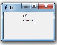
- from tkinter import *
- main = Tk()
- var = StringVar()
- label = Message( main, textvariable=var, relief=RAISED )
- var.set("c# corner")
- label.pack()
- main.mainloop()
Output-
| Option | Description |
| anchor | It is used to set the position of the text. |
| bg | It is used to set the normal background color. |
| bitmap | It is used to bitmap image. |
| bd | It is used to set the border width and the default is 2px. |
cursor | Cursor is used to create a cursor in widgets like arrow, circle, dot etc. |
| font | It is used to set the font of the text. |
| fg | It sets normal foreground (text) color of widgets. |
| height | It is used to set the height of widgets. |
image | It is used to set an image in widgets. |
| justify | It is used to justify the text of widgets. |
| padx | It is used to add additional padding on left and right of the text of widgets. |
| pady | It is used for additional padding above and below the text of widgets. |
| relief | Relief is a special type of border. The values are SUNKEN, RAISED, GROOVE and RIDGE. |
| text | It is used to display the text on widgets. |
| textvariable | It is used to store the value of widgets. |
| underline | It is used to underline. Default is -1, which means no underline text |
| width | It is used to define the width of widgets. |
wraplength | It is used to define wraping length. |
Summary
In this chapter, you learnt what message widget is and how to use the property of the widget.
In this chapter, you learnt what message widget is and how to use the property of the widget.