Tkinter Widget-Radiobutton
This widget is used to create multiple choice options in GUI Application.
Syntax-
w = Radiobutton ( main, option)
Parameter-
Main- parent Window.
w = Radiobutton ( main, option)
Parameter-
Main- parent Window.
Option- attribute of button widget.
Example-
Example-
- from tkinter import *
- def sel():
- selection = "selected" + str(var.get())
- label.config(text = selection)
- main = Tk()
- var = IntVar()
- R1 = Radiobutton(main, text="C# corner", variable=var, value=1,
- command=sel)
- R1.pack( anchor = W )
- R2 = Radiobutton(main, text="Python", variable=var, value=2,
- command=sel)
- R2.pack( anchor = W )
- R3 = Radiobutton(main, text=".Net", variable=var, value=3,
- command=sel)
- R3.pack( anchor = W)
- label = Label(main)
- label.pack()
- main.mainloop()
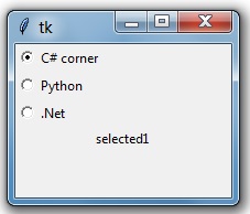
Output-
| Option | Description |
| activebackground | It sets background color of widgets when widget is under the cursor. |
| activeforeground | It sets foreground color of widget when widget is under the cursor. |
| anchor | It is used to set the position of the text. |
| bg | The normal background color behind the indicator and label. |
| bitmap | It is used to display a monochrome image on a radiobutton. |
| borderwidth | It sets the border width in pixels. Default is 2. |
| command | It is used to call a method. |
| cursor | Cursor is used to create a cursor in widgets like arrow, circle, dot etc. |
| font | It is used to change the font of the text. |
| fg | The color is used to render the text. |
| height | It is used to set the height of radiobutton. |
| highlightbackground | It is used to change the highlightbackground color. |
| highlightcolor | It changes the color of widgets on focus. |
| image | It is used to set the image |
| justify | It is used to justify the text of widgets. |
| padx | It is used to add additional padding on left and right of the text of widgets and default is 1. |
| pady | It is used to add additional padding above and below the text of widgets. Default is 1. |
| relief | Relief is special type of border. The values are SUNKEN, RAISED, GROOVE and RIDGE. |
| selectcolor | It is used to change the color of radiobutton, when radiobutton is selected. |
| selectimage | It is used to set the image on option to select. |
| state | It is used to change the state of radiobutton |
| text | It is used to add the text after the radiobutton. |
| textvariable | It is used to store the value of widgets. |
| underline | It is used to underline and default is -1, which means no underline text. |
| value | It is used to define the value of radiobutton. |
| variable | It is used to share the values of radiobutton. |
| width | It is used to define the width of widgets. |
| wraplength | v |
Summary
In this chapter, you learnt what Radiobutton widget is and how to use the property of the widget.
In this chapter, you learnt what Radiobutton widget is and how to use the property of the widget.